Single Source of Truth Workspace Tool in Dell Technologies
Productivity tool to optimize the workspace experience within Global engineering organization.
Overview
In the company-wide digital workspace modernization effort, I led the design effort of a new, holistic workspace home the replaces legacy applications and provides centralized process and easy access to information
in different services.
I defined the product and experience through research and advocated user-centric approach to the product. During the process, I initiated practice of user and process documentation and created application’s structure and behavior which increase workspace efficiency by 43%.
I defined the product and experience through research and advocated user-centric approach to the product. During the process, I initiated practice of user and process documentation and created application’s structure and behavior which increase workspace efficiency by 43%.
Project Goal
- Lift and shift + redesign of functions
- Soft conversion of early adopters
Team
- 12 Cross-functionals + 1 Designer
(9 Developers, 2 BAs, 1 PM)
Timeline
- 3 Months duration
- Launch in late 2022
Users
Clear understanding of users’ perspective was the first requirement of design solutioning.
Our users are more than their “tasks”
I noticed discrepancies between the business northstar and the actual user needs: the product team’s understanding on the users were mainly based on their in-app task, with no focus on their behavior, attitude, and context. Eager to establish clear and shared understanding of the end users, I created end-user persona based on each types of engineer.
![]()
![]()
![]()
![]()
![]()
![]()
![]()

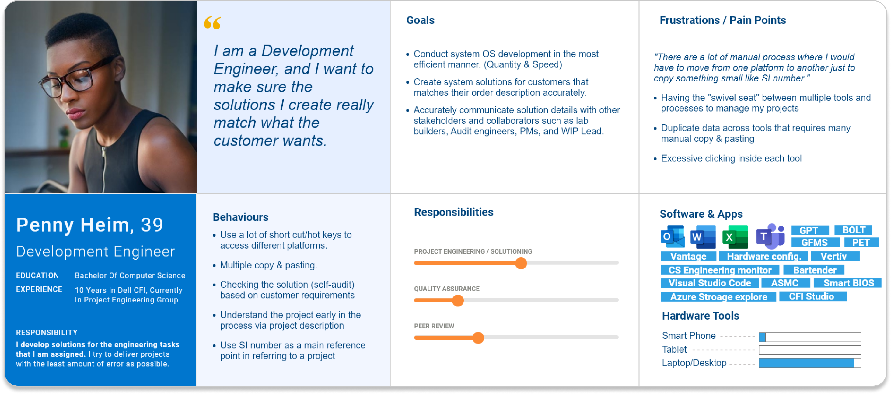


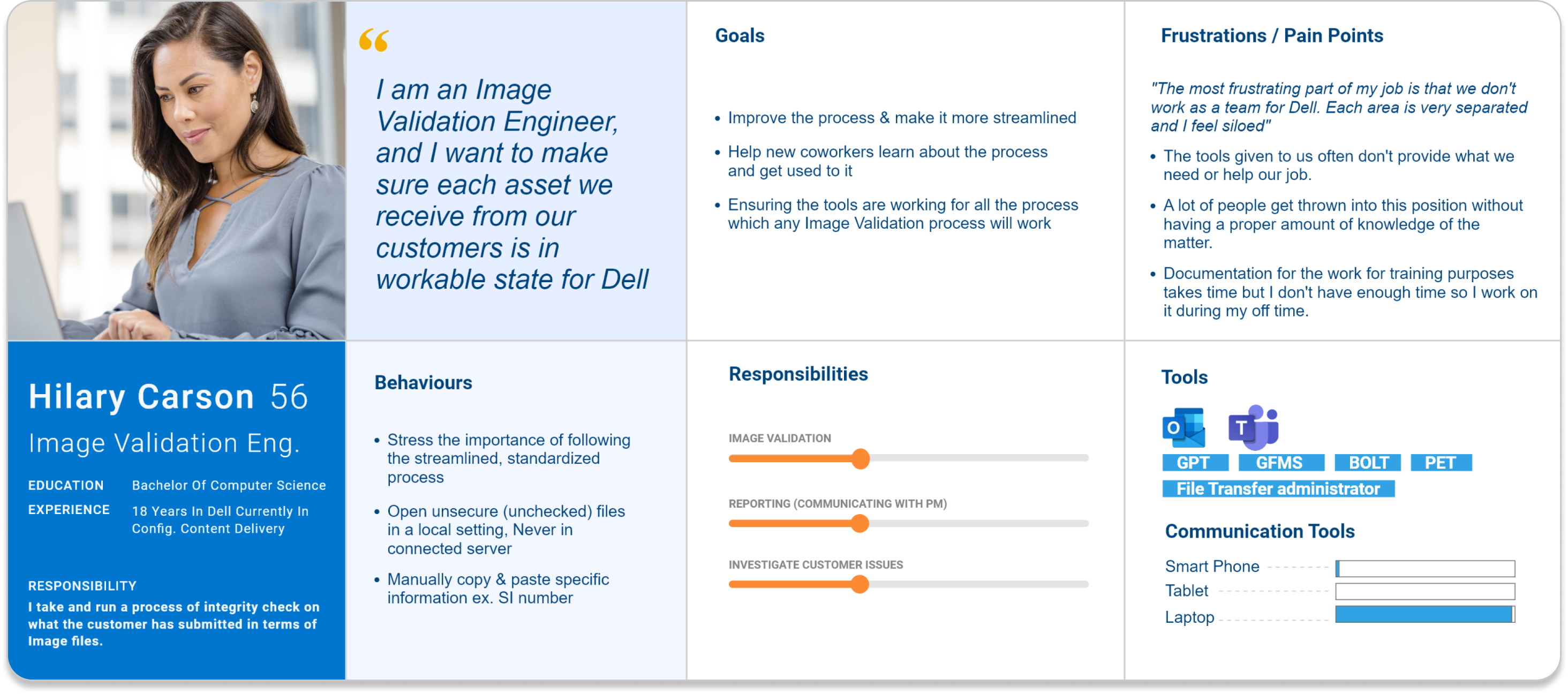
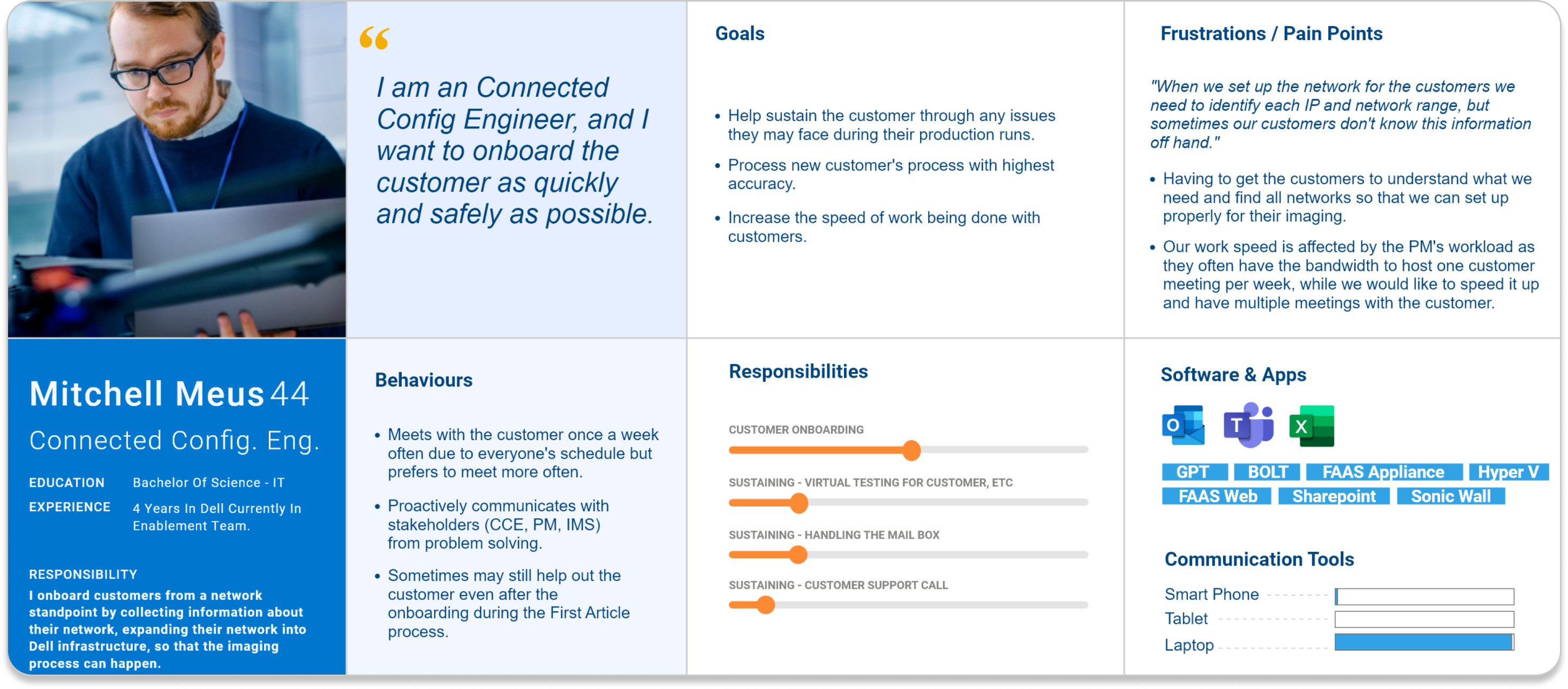
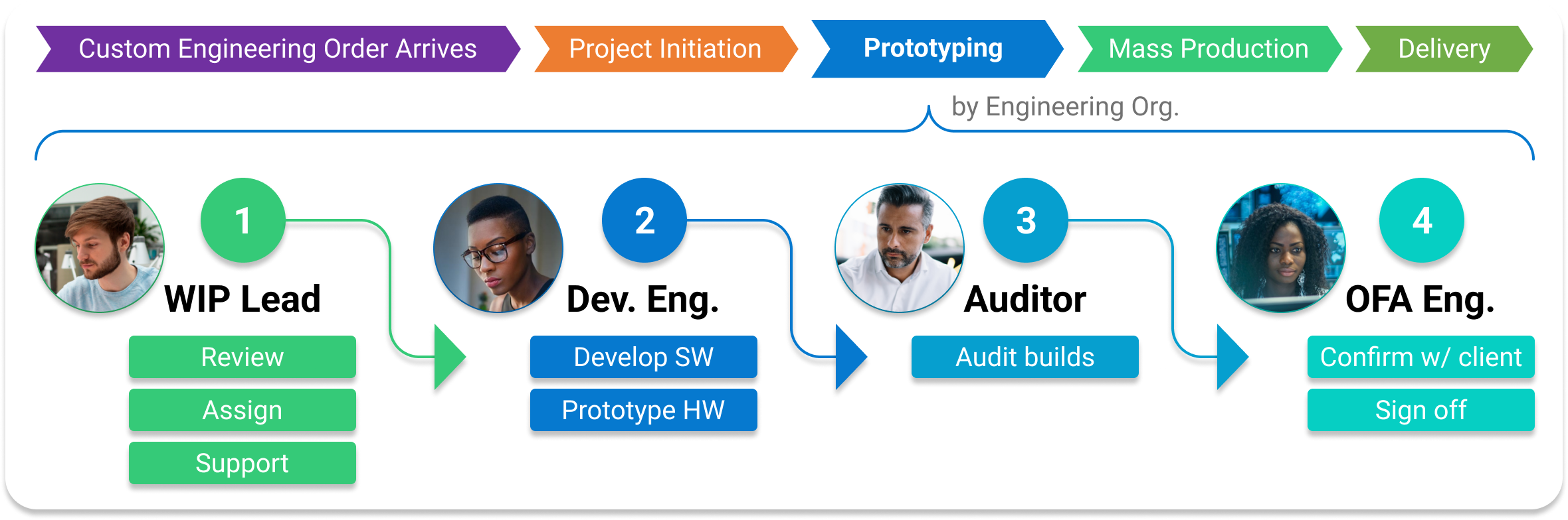
User working in a production line
Engineers of different roles collaborated in complex engineering order fulfillment process by passing work from one station to the next
until the product is ready to be mass-produced.
![]()
Discovery
I practiced mixed research methodology
to understand user’s process, behaviors, and attitutdes. The research included, but was not limited to, multiple 1:1 user interviews, user shadowing, focus group studies, and contextual inquiries.
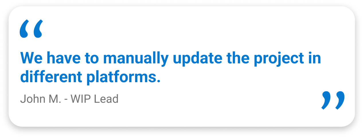
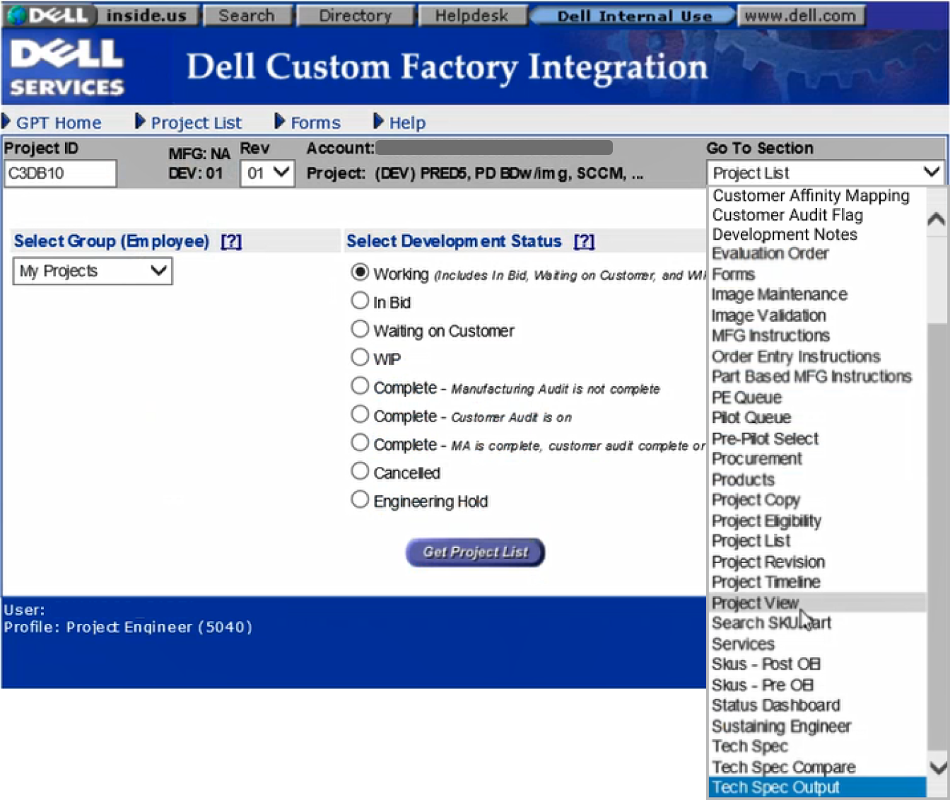
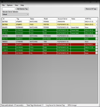
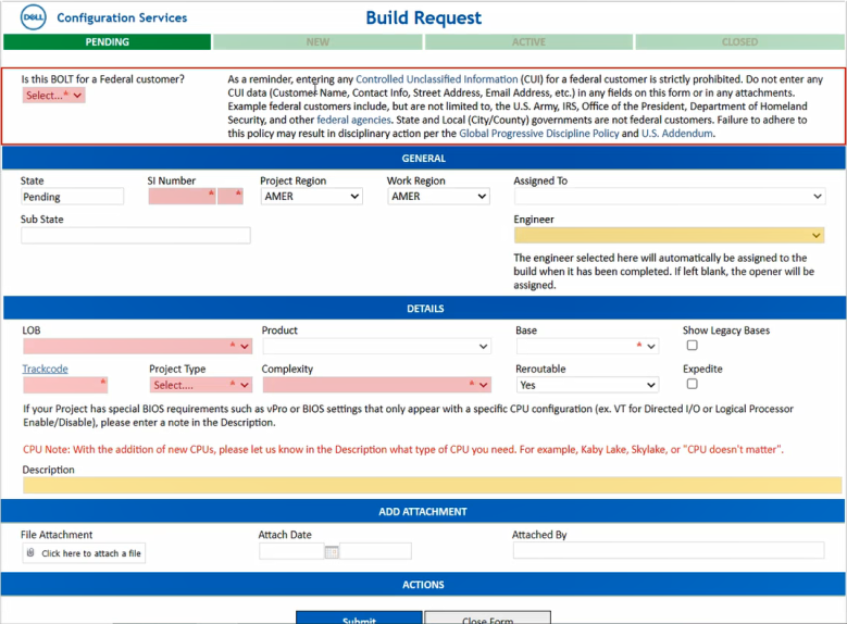
Siloed digital ecosystem
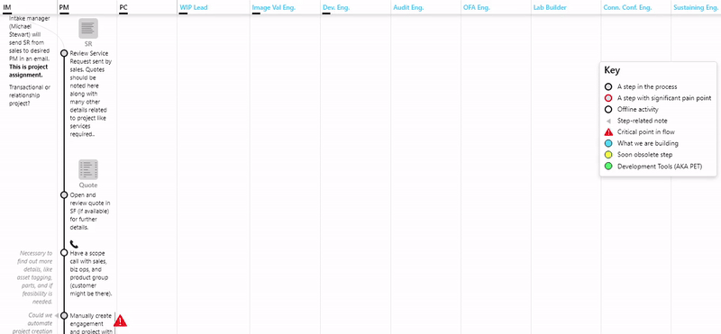
I shadowed 10 end-users
to further understand the user’s detailed processes within the service. By mapping out the service blueprint, I was able to not only document a process that did not have a clear, holistic documentation of, but also uncover the complexity that lies within the user’s day-to-day jobs to be done.
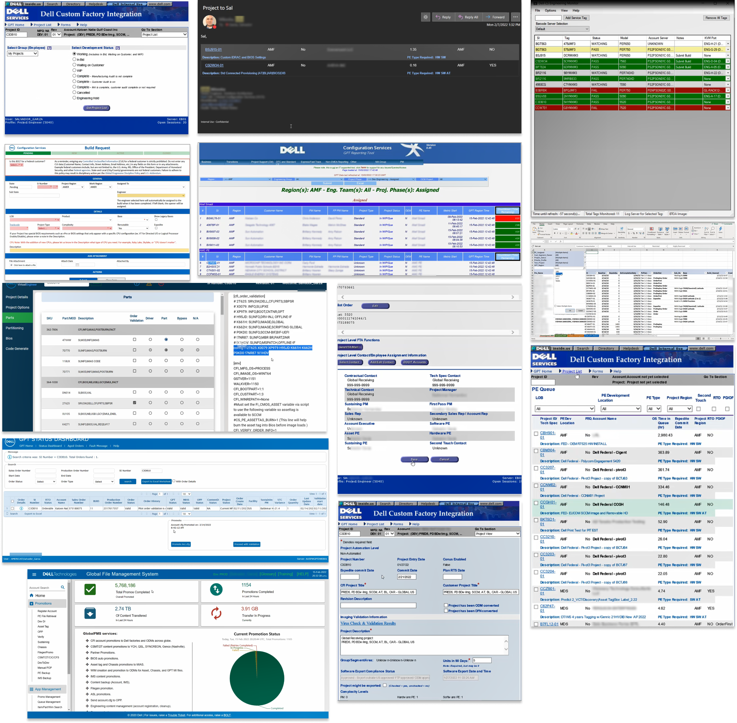
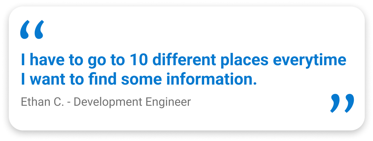
I discovered a fatal complication of workflow in which
users were frequently swivel seating between 20+ in-house and third-party applications throughout their day. This excessive swiveling was due to the disconnection between applications followed by siloed practices within the digital ecosystem.
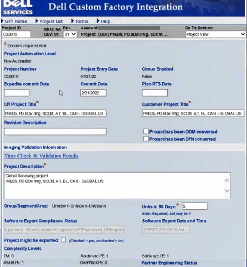
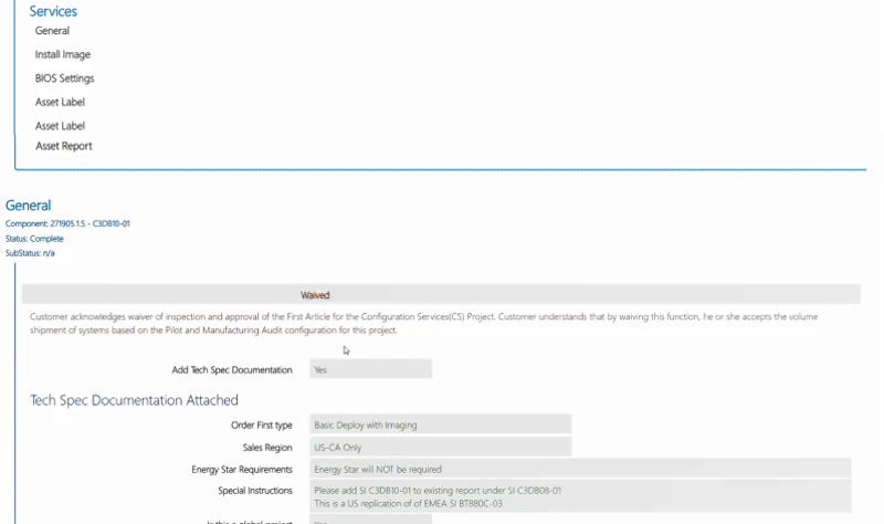
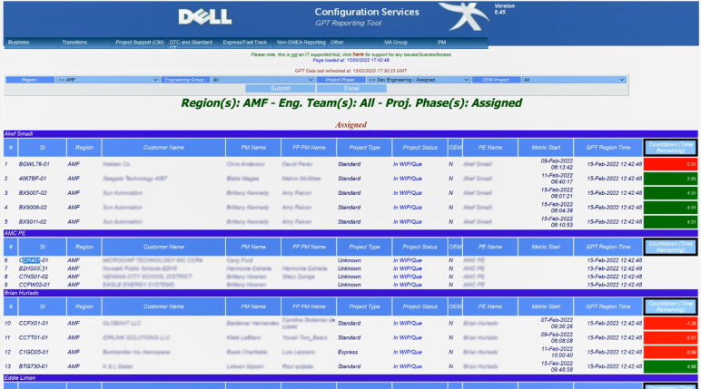
Foraging for information
In the legacy system, the exhausitive information spreaded piece-by-piece accross different pages were
required users to navigating through many pages and going through long scrollings to forage for information specific for their tasks at the moment. The excessive traveling between pages and scrolling caused inefficient economy of movement.
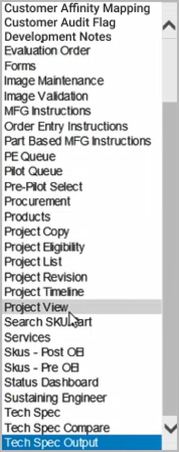
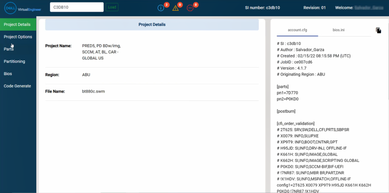
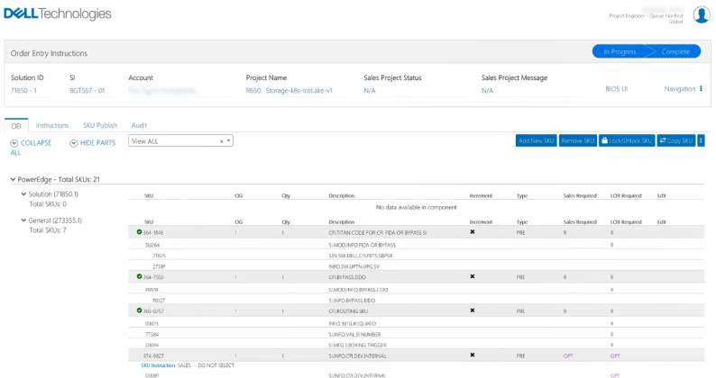
Multiple usability issues throughout the service workflow
While the legacy applications were technically feasible, they were not easy to use and learn. I have found many usability issues shared among multiple applications. There were 3 main issues that were greatly affecting the workflow efficiency which were:
1. Ambiguous terminologies.
Many platforms had different ways to address the same object. Inconsistent terminology and overused accronyms disturbed intuitive use of the tools, setting a high learning curve.
Many platforms had different ways to address the same object. Inconsistent terminology and overused accronyms disturbed intuitive use of the tools, setting a high learning curve.
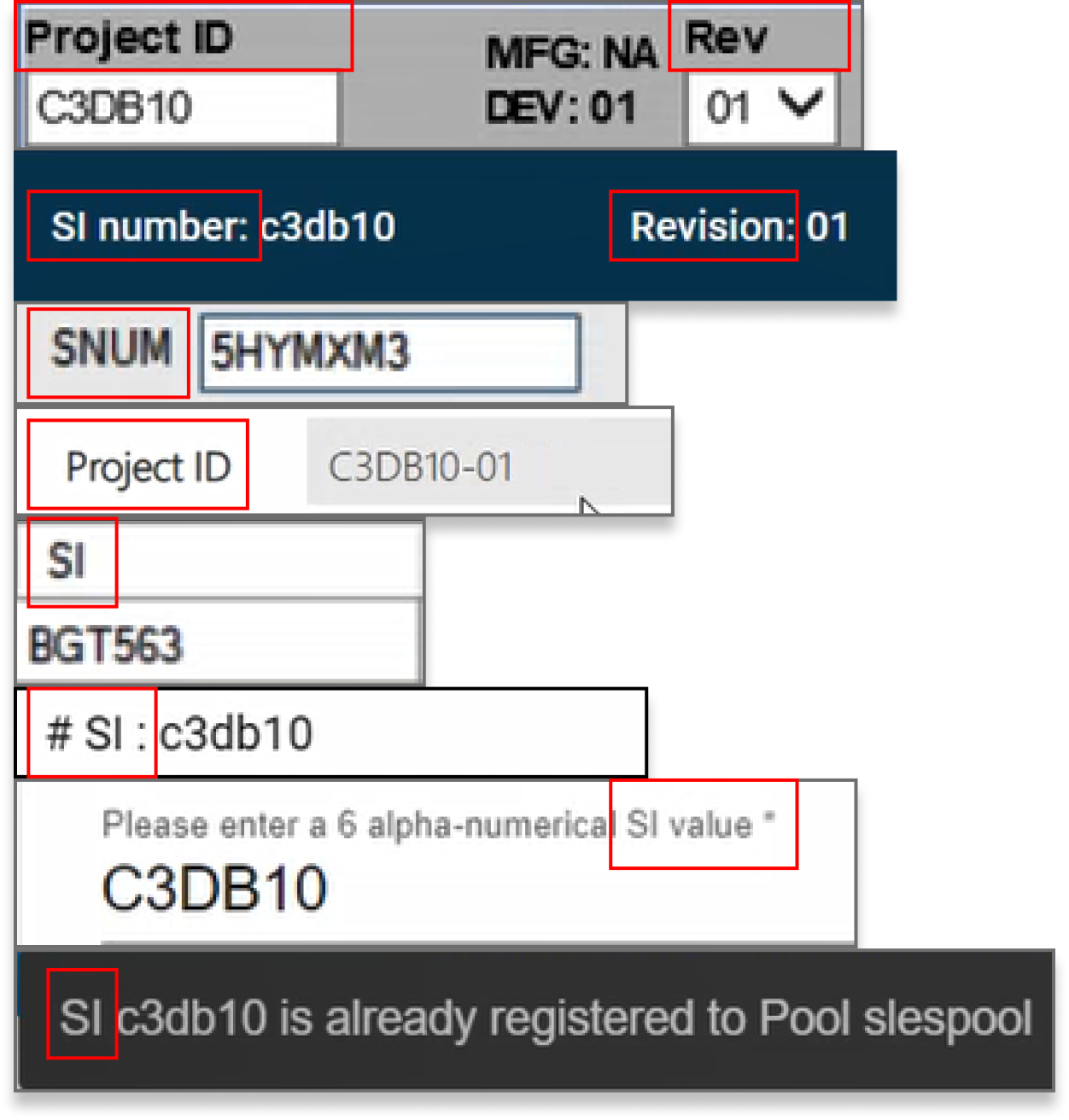
- Solution ID = Solution #, Solution Number, SNUM, SI, Solution ID, Project ID Project Number, PN #
- Development Engineer = PE, Project Engineer, Development Engineer
2. Hard-to-use and incomplete navigation.
Cluttered in-app navigations left users disoriented while the links often did not function properly which confused users.
Cluttered in-app navigations left users disoriented while the links often did not function properly which confused users.
3. Inconsistent design element.
The tools were created prior to Dell Design System and were never updated. The inconsistent UI led to unstandardized communication methods in colors, icons, and interaction patterns.
The tools were created prior to Dell Design System and were never updated. The inconsistent UI led to unstandardized communication methods in colors, icons, and interaction patterns.
Challenge: How can we simplify the service line work experience?
(In both macroscopic structure and microscopic interaction perspective)
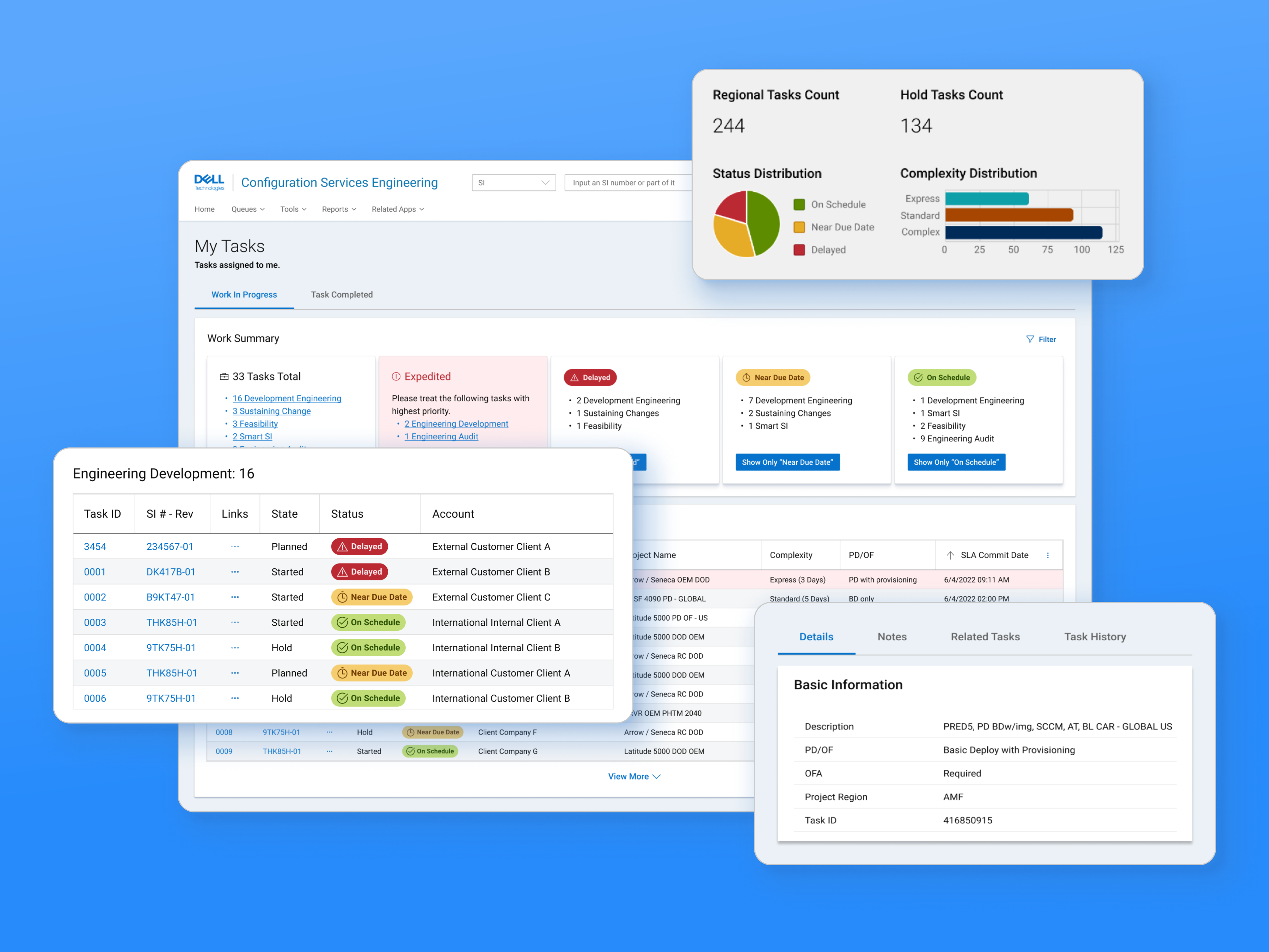
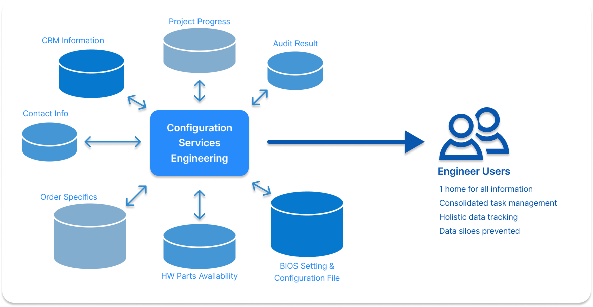
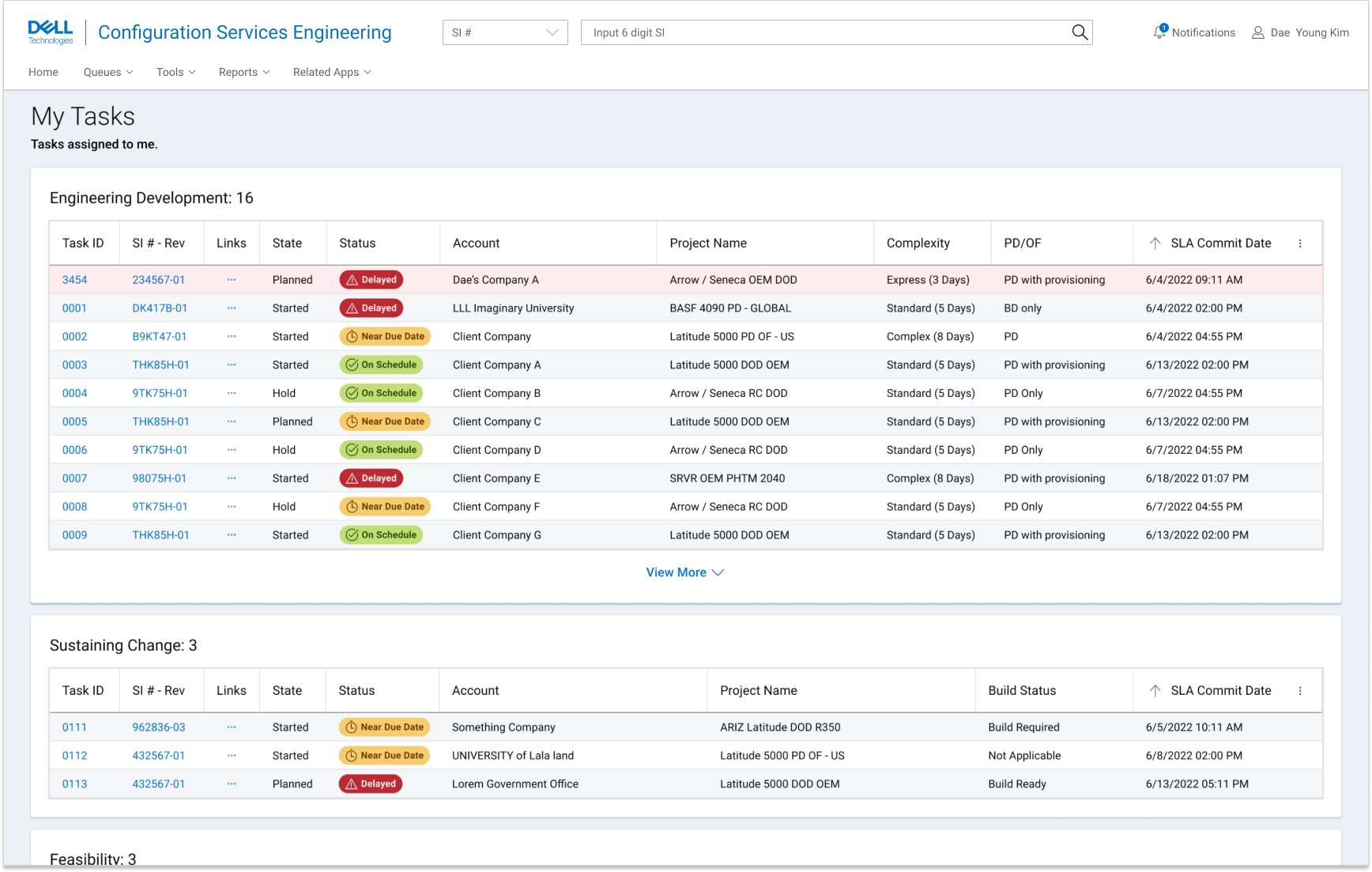
Digital ecosystem: A Single Source Of Truth workspace home
Digital ecosystem: A Single Source Of Truth workspace home
Critical information and functions being spreaded accross many locations required users to swivel seat excessively. A
single workspace home
where data aggregates and is distributed was needed to create a more centralized, consolidated servicing experience for internal users.
![]()
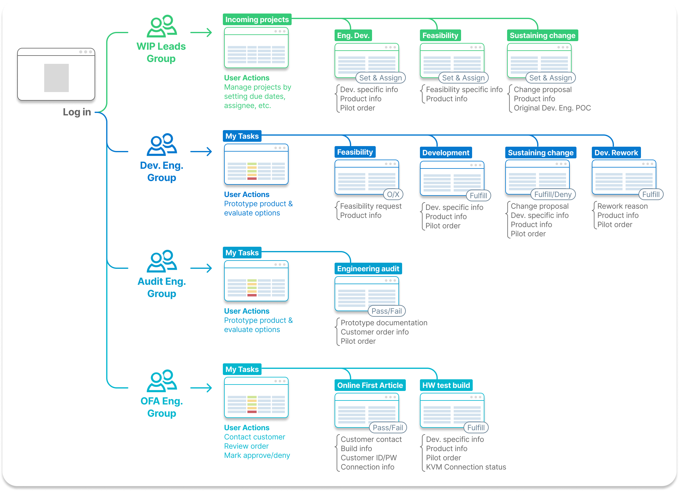
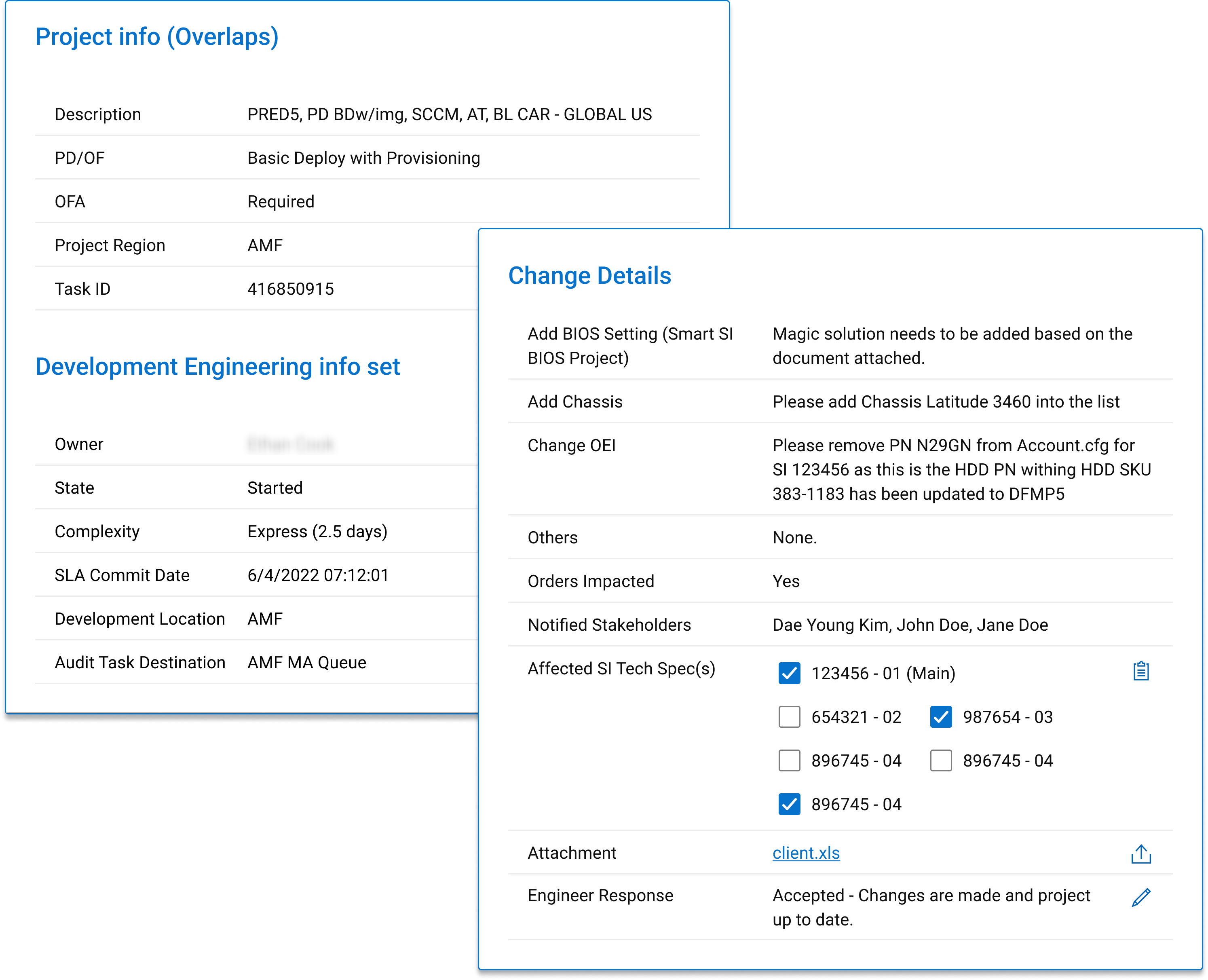
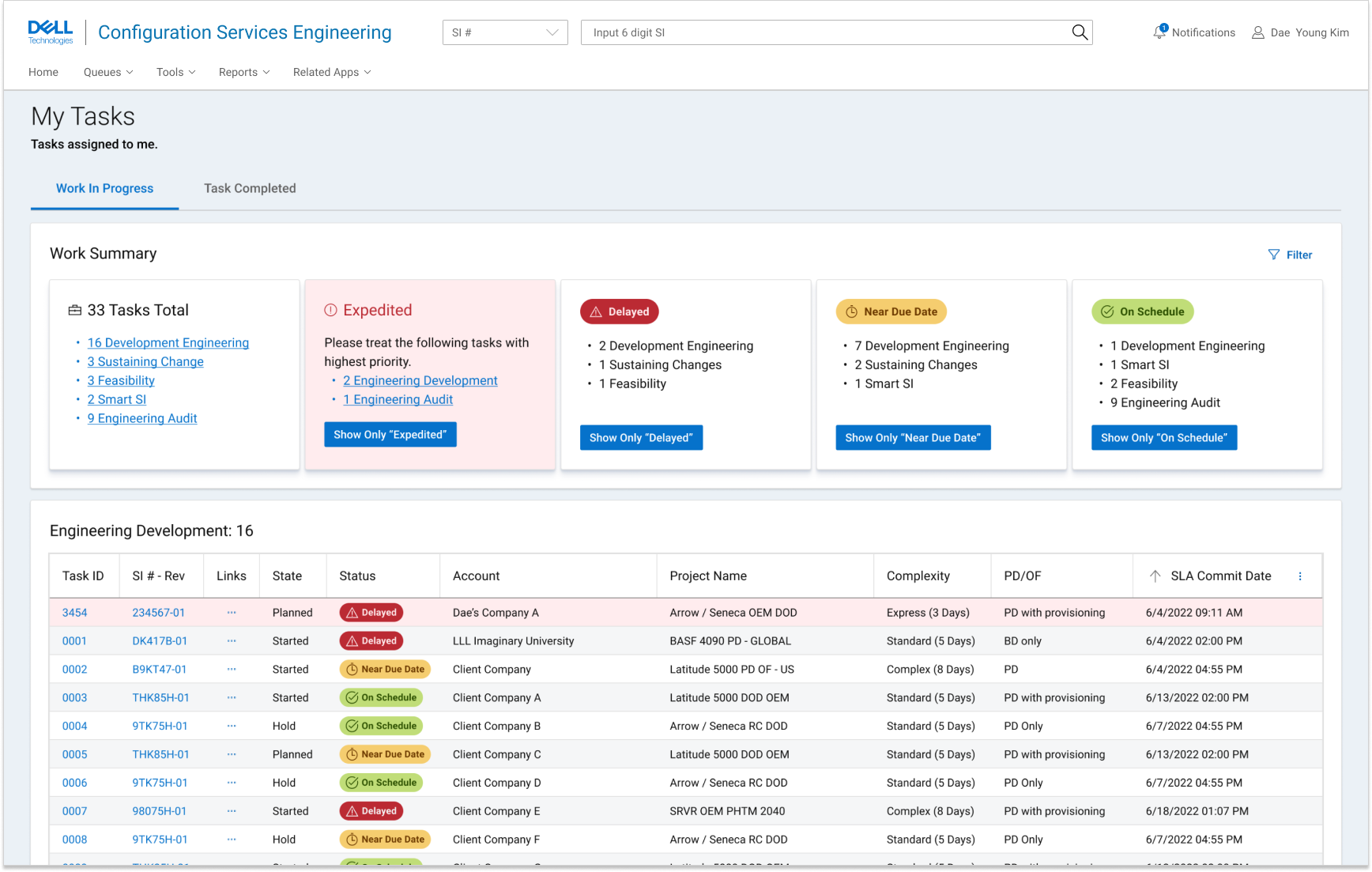
Practice: Providing what is necessary to those who needs it
Individual users required different sets of information and functions based on their roles. In the legacy process, users had to spend time foraging for the materials they need. I hypothesized that providing personalized materials to the users will reduce unecessary use of time. I have put users in 8 groups based on their roles and divided project into multiple tasks providing focused view.
![]()
To provide the personalized materials based on each user roles, I had to understand how the users’ minds categorize each pieces of information and which pieces of information are critical per different tasktypes.
![]()
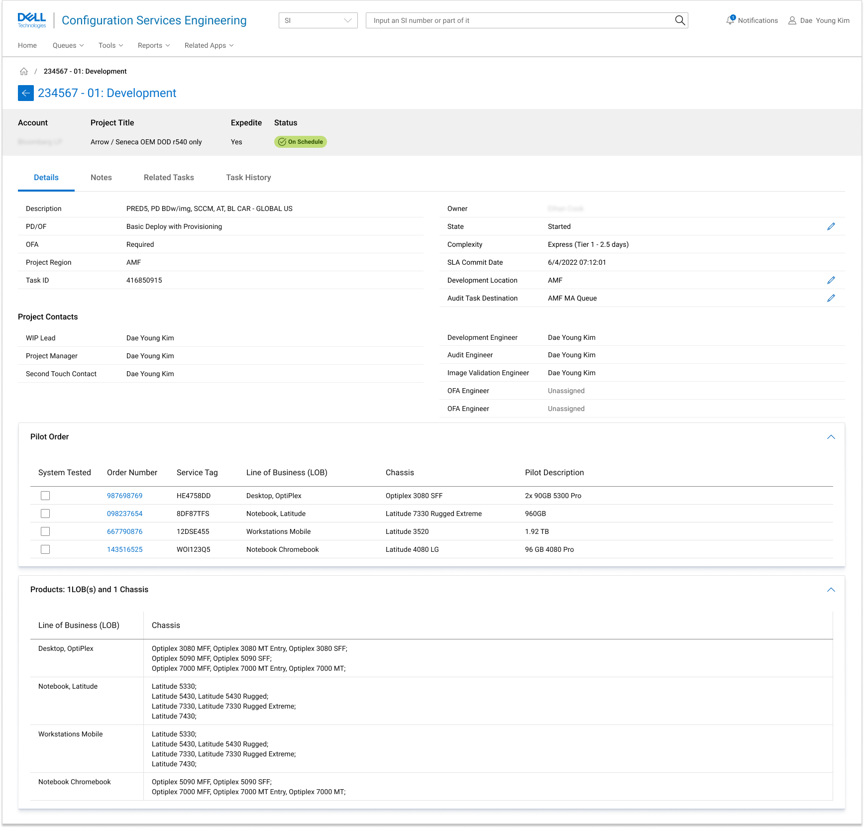
We made decisions to:

- Have both project and type-specific task details always and easily accessible by users,
- Group information in modules for clear and easy access (& reusable in dev perspective),
- Grant “edit” authority to each users based on their roles.
Interaction: Improving usability
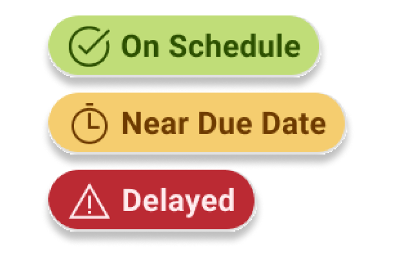
Standardized Communication
The visual and descriptic communication were not standardized accross platforms. I redefined colors, iconography, and terminology based on user concensus.
The visual and descriptic communication were not standardized accross platforms. I redefined colors, iconography, and terminology based on user concensus.
Before
Mixed terminology per platform
![Mixed terminology per platform]()
Mixed terminology per platform
After
Standardized terminology
![]()
Standardized terminology

Unexplained, inappropriate icon uses
![]()

Status Icons and colors redefined
![]()
Unstandardized colors
![]()
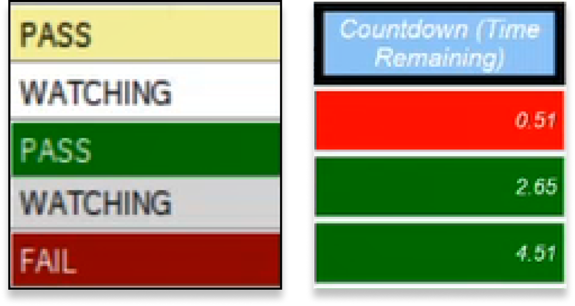
Colors standardized
![]()
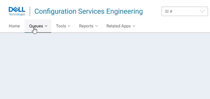
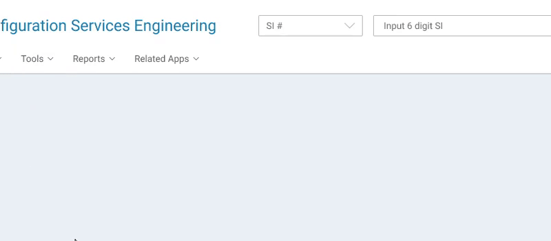
Navigation
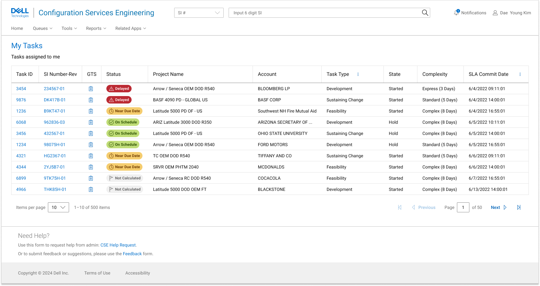
It was difficiult to find desired items in the legacy portal application’s navigation as the list was long, unstructured, and required a lot of scrolling. I have reorganized the navigation items into a more intuitive format that supports the new structure. This change in particular reduced time of navigation to 40%.
It was difficiult to find desired items in the legacy portal application’s navigation as the list was long, unstructured, and required a lot of scrolling. I have reorganized the navigation items into a more intuitive format that supports the new structure. This change in particular reduced time of navigation to 40%.
Before
Cluttered without grouping or pattern
![]()
Cluttered without grouping or pattern

After
Grouping based on relativity
![]()
Grouping based on relativity
Long list in alphabetical order
![]()
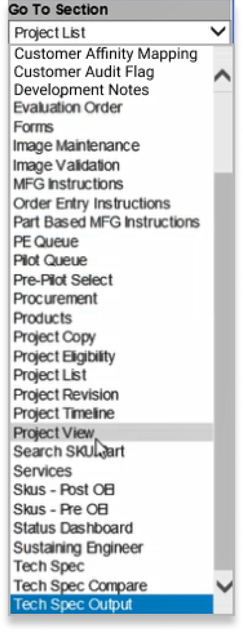
Consolidated structure by establishing hierarchy
Structure
The legacy applications necessitated a lot of vertical scrolling and deepdiving into the rabbithole. I decided to redistribute and breakdown features to minimize users going down the rabbit hole.
The legacy applications necessitated a lot of vertical scrolling and deepdiving into the rabbithole. I decided to redistribute and breakdown features to minimize users going down the rabbit hole.

Design iterations
The design focus of this tool was consolidated delivery of information and adequate support for user’s potential actions. Immediate testing for the information and interactions was important, especially for the users who were dependent on the critical information and process.
Quick proof of concept
To-do list summarized and consolidated for faster and more thorough understanding
1. I first designed a minimal dashboard that works as a simple list which presents user’s jobs-to-be-done.
2. I found that the to-do list which contains all task requires users has to search for an item and creates complication on the user’s end. I decided to redistribute the items by task types.
3. Having multiple lists of work items came with drawbacks of longer scrolls which made it harder to gain a holistic sense of user’s tasks. I added a summary section which provides overview and notifies users of work items that requires attention.
Clearly sectioned details for better mental model
1. The Task Details pages were first designed with focus on curating the necessary information to the users without other distractions.

2. While the right information was delivered concisely, the unclear indication of regions was stopping users from creating concrete mental model. I made the distinction between the regions more clear. The style change helped users identify and locate the information they need easier.
Final designs
Dynamic information based on user needs
Interactions close ups
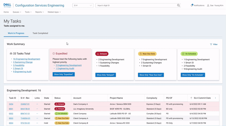
Overview section and dashboard navigation
![Overview section and dashboard navigation]()
Quick shortlisting
![Quick shortlisting]()
Quick shortlisting

Key Improvements
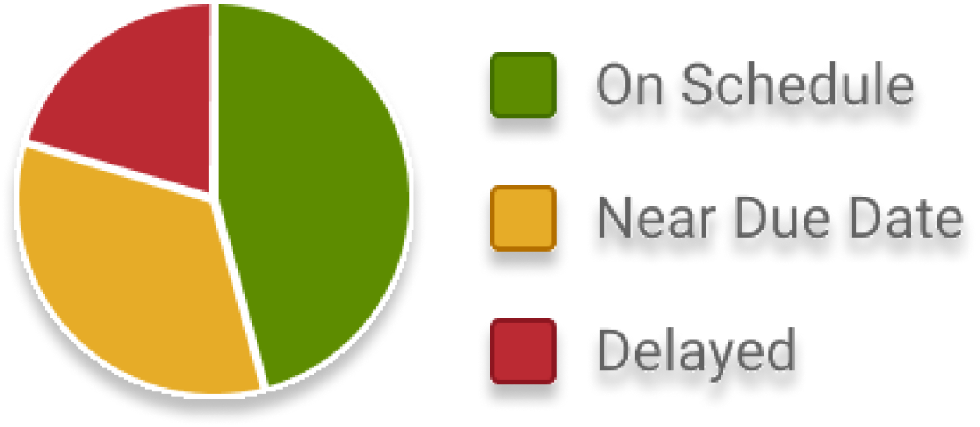
67%
Reduced swivel seating in the entire workflow
43%
Reduced average time of users gathering information
Learning
Starting a practice of user and process documentation
I shared clear understanding of the users and their process with other stakeholders.
Creating a detailed service blueprint was a challenge but brought shared clear understanding of users and their process. The team started to invest more time on getting that clear vision first along with design inputs, rather than jumping straight on to the problem.
Internal design shares
I initiated internal design shares with designers from other projects to prevent a galapagos-like situation where the in-app experiences were siloed. I have initiated service level discussions to create a more cohesive ecosystem of digital products.