Searching Experience in Digital Workspace
A User-centric Search experience which brought user trust and eventually built a design-centralized culture in the product team.
Overview
During Dell’s digital workspace modernization effort, I reformed the system-user communication structure to create a more intuitive interaction and eventually increase the user satisfaction.
I led the research, designed a new communication method, and promoted an experience-oriented approach, boosting user satisfaction by 114% and building trust in the product team.
I led the research, designed a new communication method, and promoted an experience-oriented approach, boosting user satisfaction by 114% and building trust in the product team.
Project Goal
- Make intuitive information calling method
Team
-
4 Cross-functionals + 1 Designer
(2 Developers, 1 BAs, 1 PM)
Timeline
- 3 Months duration
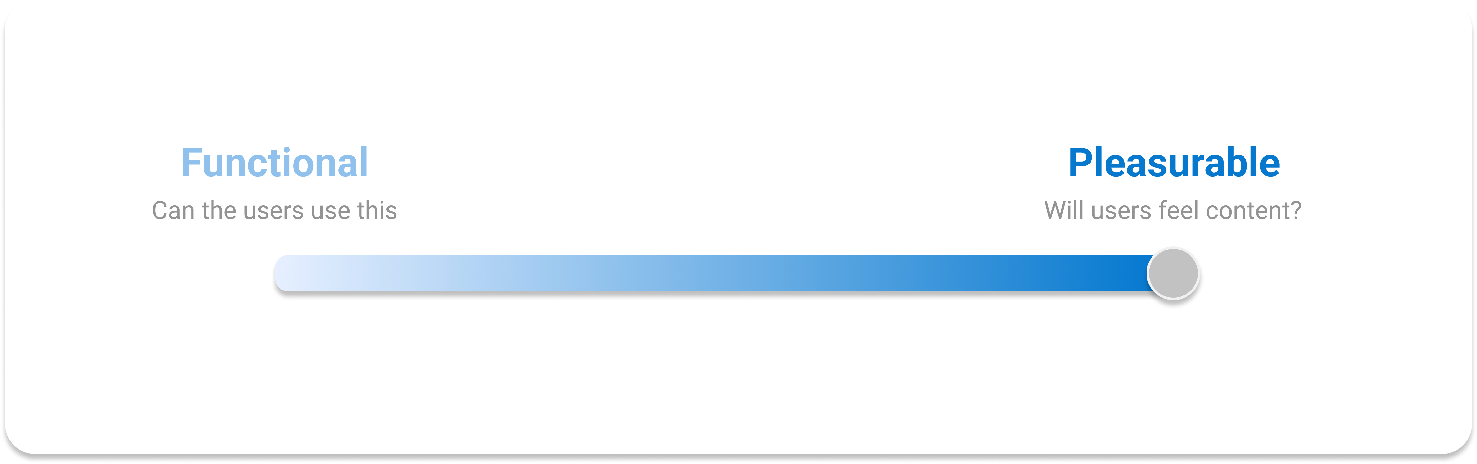
Moving towards holistic User Experience
The
product team initially prioritized user task-oriented requirements.
I aimed to enhance the product’s vision by emphasizing a user’s holistic and convenient experience accross the application.
![]()
Search experience played a big role in bringing pleasurable user experience by enabling convenient operation in the application.
We enhanced efficiency, trust, and user engagement, speeding up the shift towards a more design-centric culture in our previously development and business-focused team.
![]()
Users
Core users are at the forefront of engineering operation, requiring fast and light access to information.

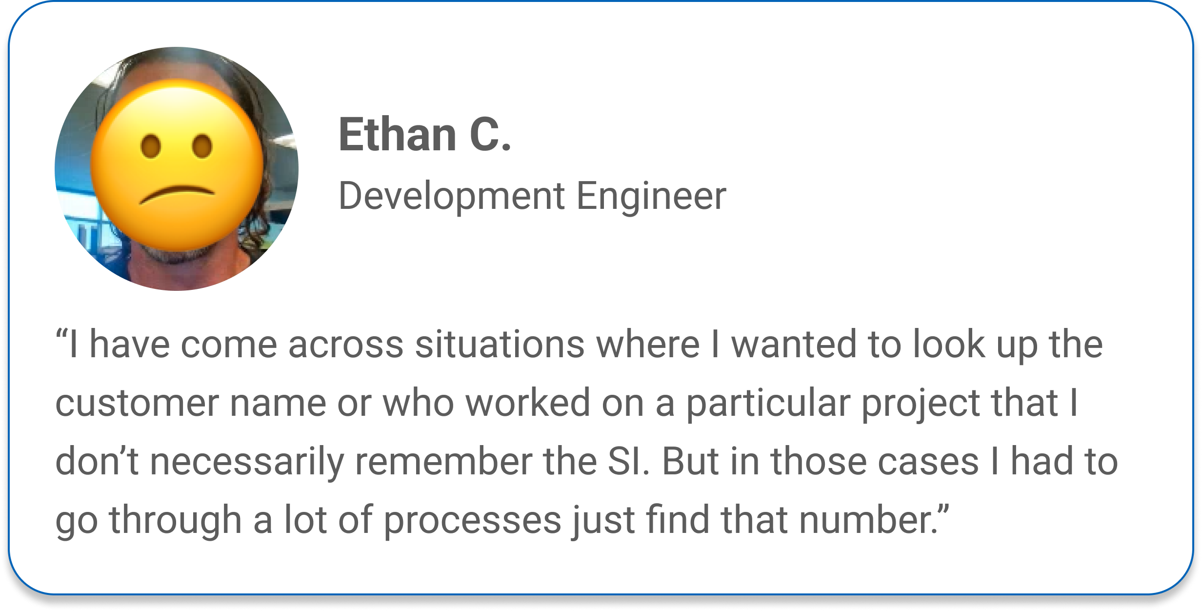
Penny
An Engineer at the forefront of Dell’s complex engineering order fulfillment process: building & testing computers to be produced.
“I deliver custom solutions that are true to order, in a timely manner.”

Chris
A WIP Lead (Work In Progress Lead) ensuring quality and timely delivery of projects by assisting the engineering team as a regional manager. “I ensure on-time delivery by providing necessary support for my team. ”
Learning the ins and outs
I have started the initial learning process by defining problem and opportunity spaces.
User Shadowing & Interviews: Understanding the process and attitudes to the minute details
Data Collection: Quantitative measures to further define problems
![]()
![]()
User Shadowing & Interviews: Understanding the process and attitudes to the minute details
Data Collection: Quantitative measures to further define problems

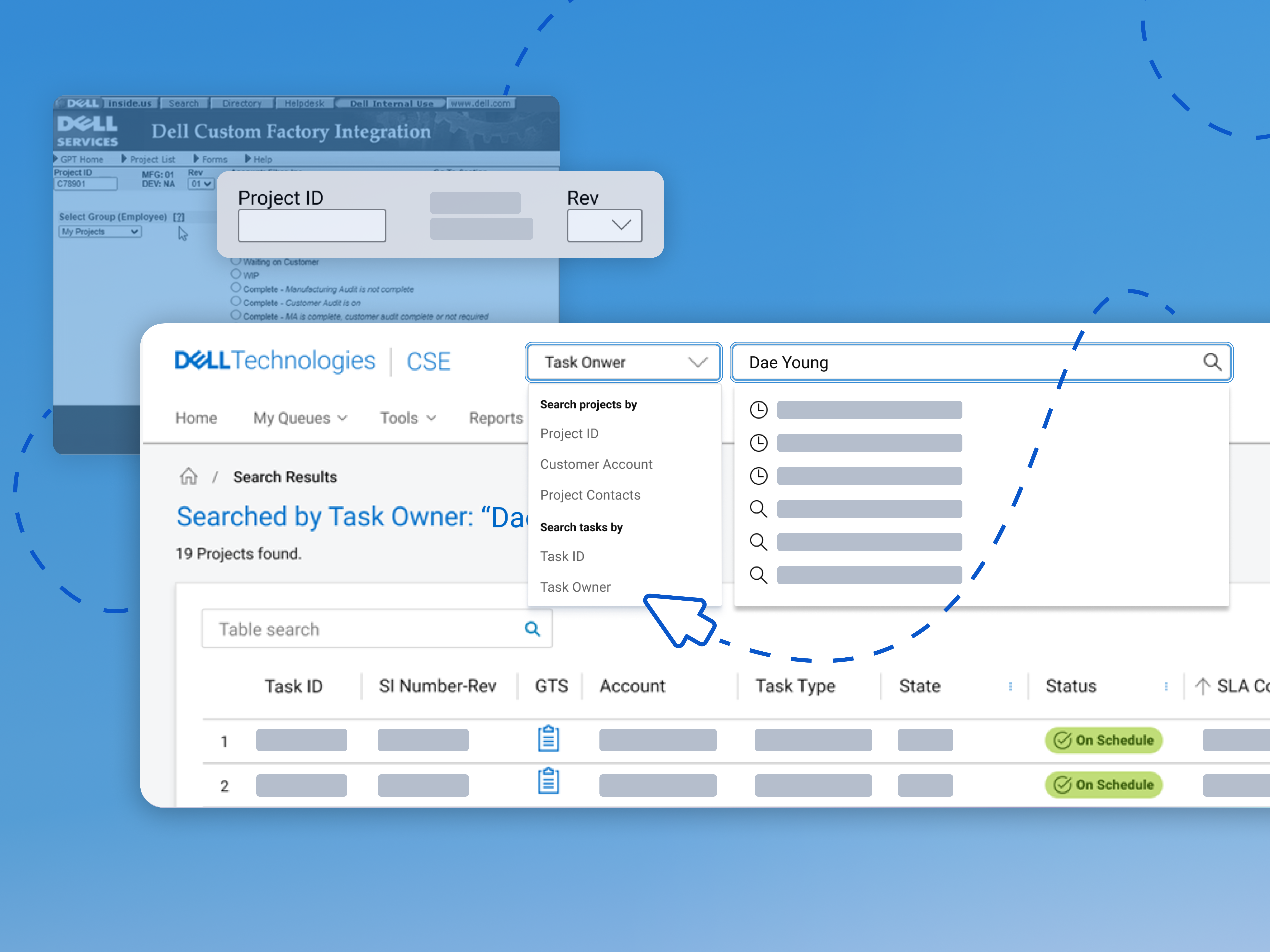
Problem Space: Users under system contraints
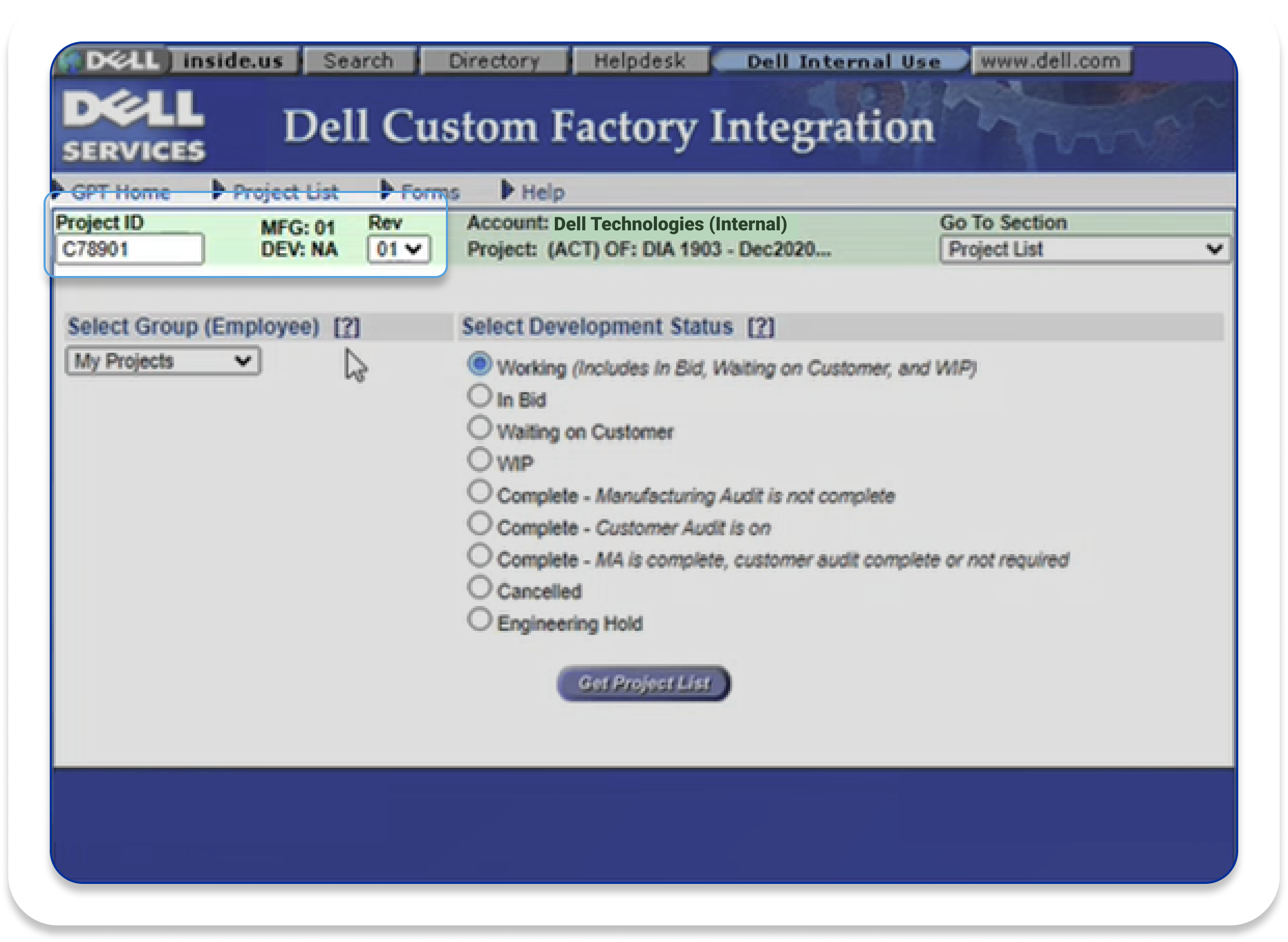
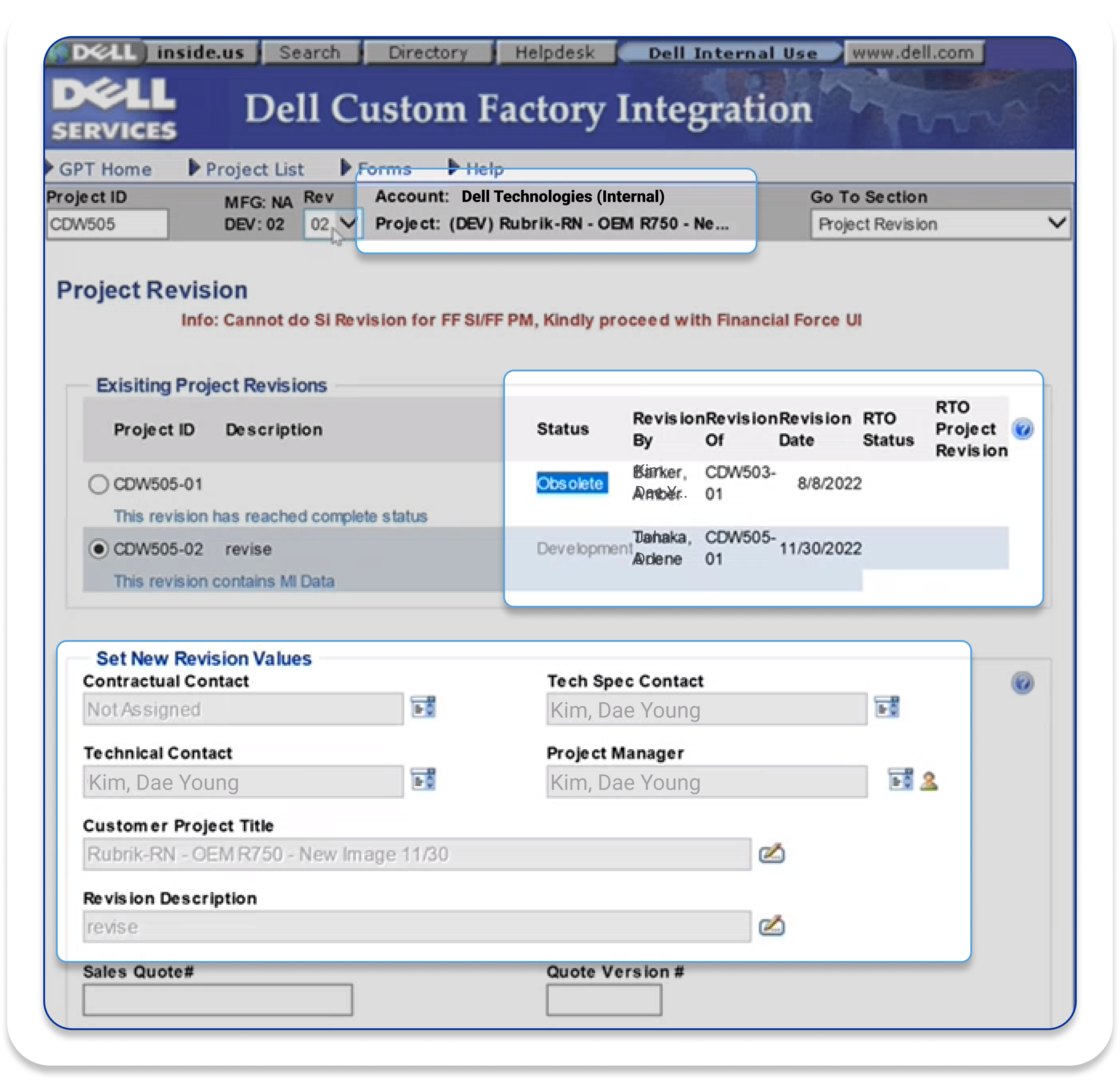
In the legacy platform, the users were forced to fit themselves to the contraining method of the system, not the system supporting and assisting the users.
Rigid system interactions limited the engineers’ capabilities.
- Non-human readable ID is hard to remember (especially when 40 to 60 cases a day)
- Users had to undergo many swivel seating just to copy & paste the ID
- Users often resorted to long, manual communication
Pinpoint-loading approach
limited the engineers’ autonomous actions.
- Returning single item detail at a time prevented holistic comparative view
- Users were prone to errors and uneccessary repetitions
Problem space: Being “Used to it”
15+ years of inefficiency.
Opportunity space: The satellite knowledge
Users remembered satellite knoweldge better than Non-human readable ID number.
The solution focused on fully utilizing information users can familiarize themselves better.
The solution focused on fully utilizing information users can familiarize themselves better.

Challenge
User Problems

Rigid in-app interaction
Pinhole Visibility
Repetitive Loading
Solution
Empowering users by bringing their agency and autonomy into their workflow.
By bringing...

Human Focused Operation
Diversify human-system communication channel to have system operate based on human behavior.
Searching, Not Loading
High-level view of items which enables users to compare, decide, and view further details.
Flexible Access
Pathway where users can navigate to various items flexibly based on their needs.
Design Process
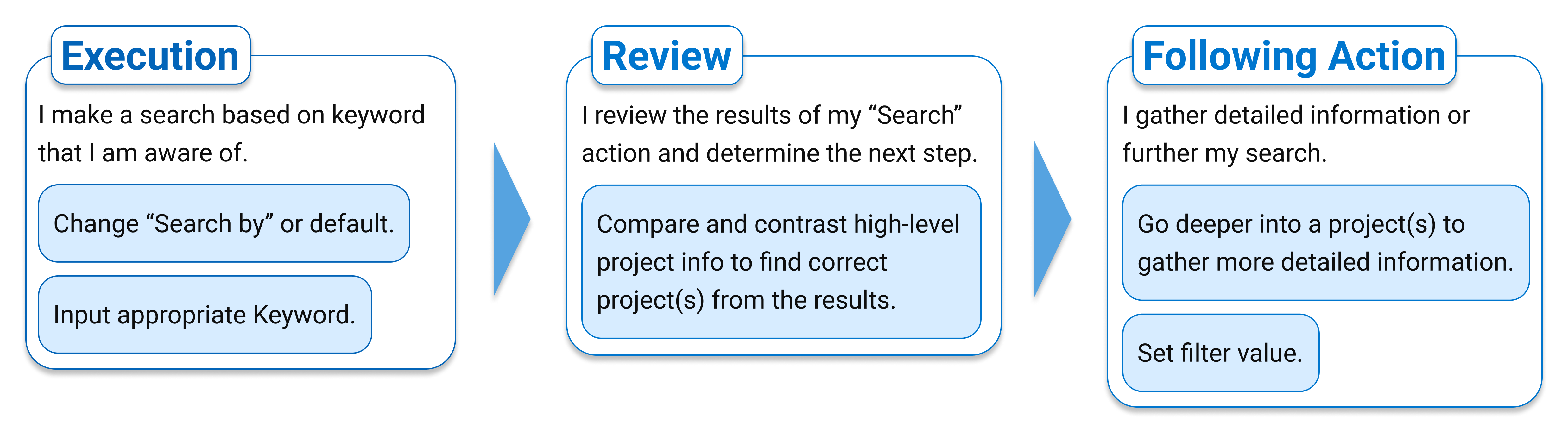
Simplifying the User Actions
When users are searching for information, their actions can be broken down into 3 phases.
These 3 user actions became the bone structure of the feature.
![]()
These 3 user actions became the bone structure of the feature.
Consolidating the Process
The new process increases “economy of movement” of the users.
The legacy application’s information loading approach was unnecessarily rigid, repetitive, and unclear. The new design solved above inefficiency issue by providing a more forgiving methods of execution and error recovery.
![]()
The legacy application’s information loading approach was unnecessarily rigid, repetitive, and unclear. The new design solved above inefficiency issue by providing a more forgiving methods of execution and error recovery.
1.
Keyword based, more flexible “Searching” action.
2.
Providing high-level view and consolidating error recovery process.
3.
Adding reviewing and filtering process to increase accuracy of searching.
Competitor Research
Wireframes
Priority interaction methods throughout the 3 key user actions were drafted after evaluating the low-fi variants based on possibility vs. plausibility and user adoption strategy.
![]()
Low-fi: User making a search
- Variants included: Feature initiation, Keyword only, Category & Keyword.
- Decided to use Category & Keyword method based on usability, focused and faster processing.
Low-fi: Viewing searched results
- Variants included: Summarized description based display, and Table view.
- Table view option matched with user’s behavioral pattern, and more fitting for providing the comparative view.
4 Key Features
System supporting the users’ methods, not the other way around .
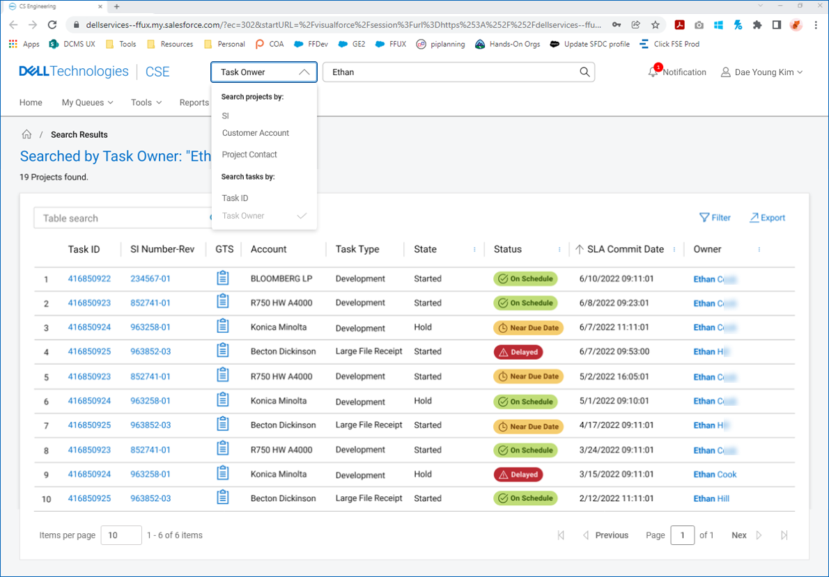
Search by categories follows the users’ mental model of how they understand each project.
![]()
Search by categories follows the users’ mental model of how they understand each project.

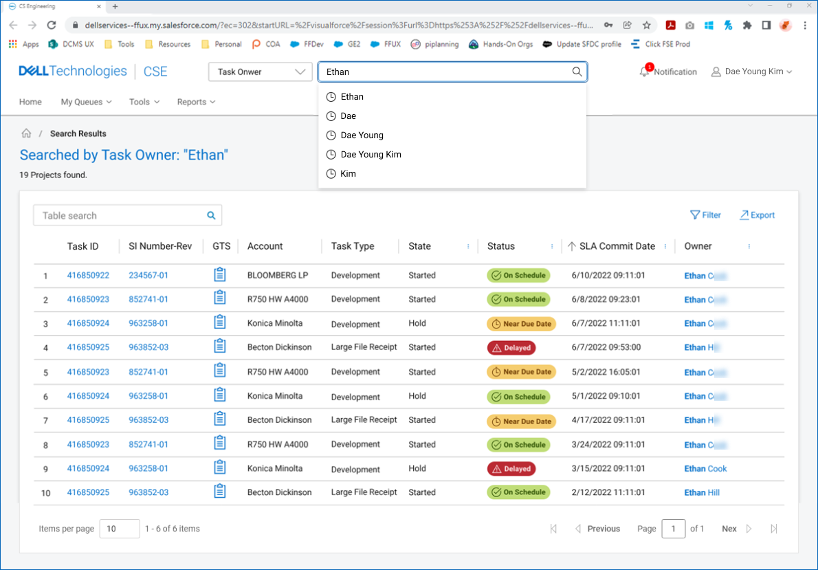
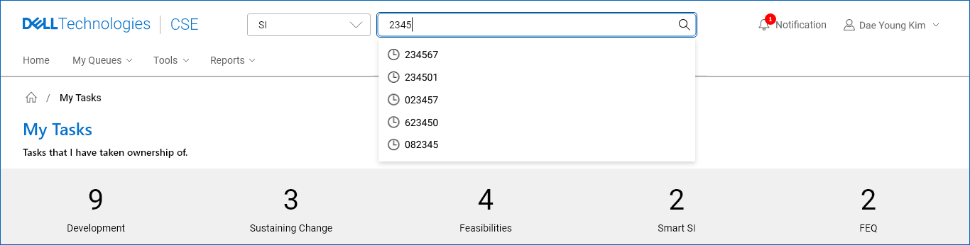
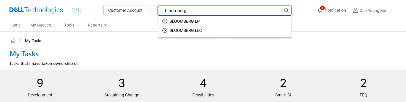
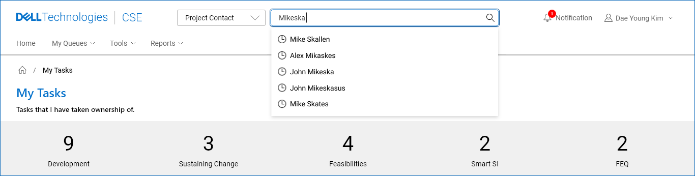
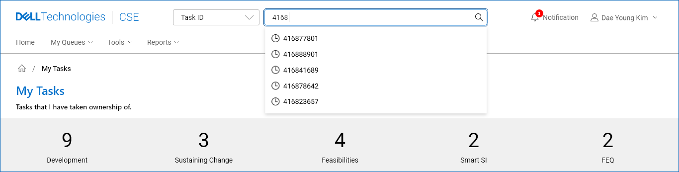
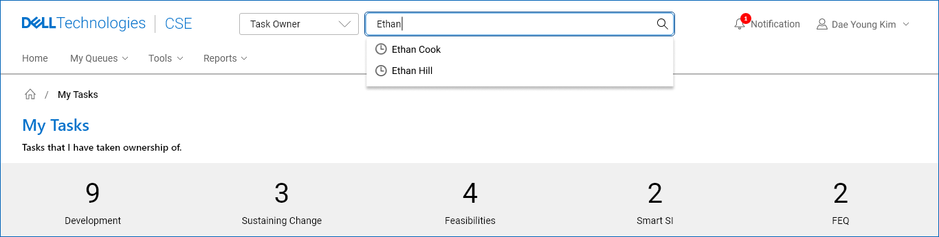
Keyword suggestion relieves user’s cognitive burden.
Upon typing, users are provided with historical and contextual suggestions.
![]()
Upon typing, users are provided with historical and contextual suggestions.
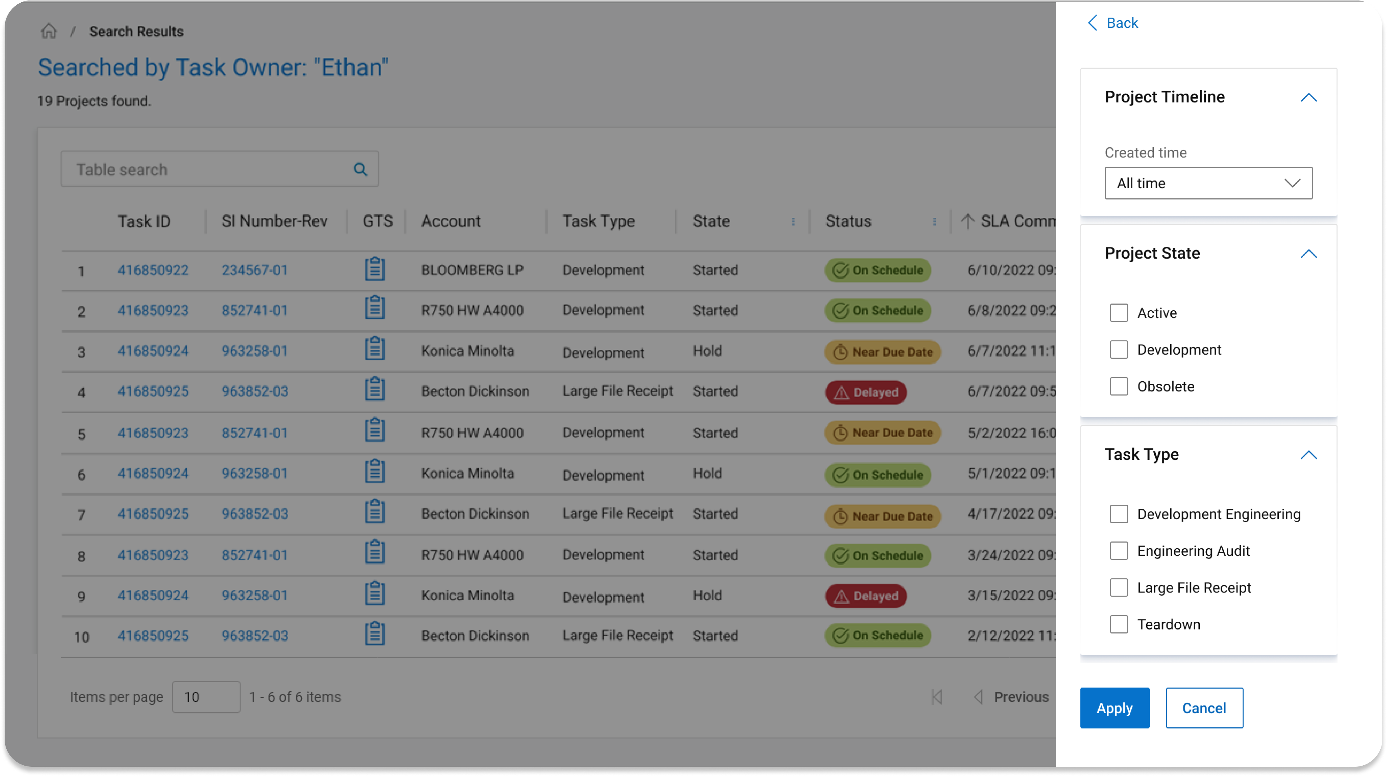
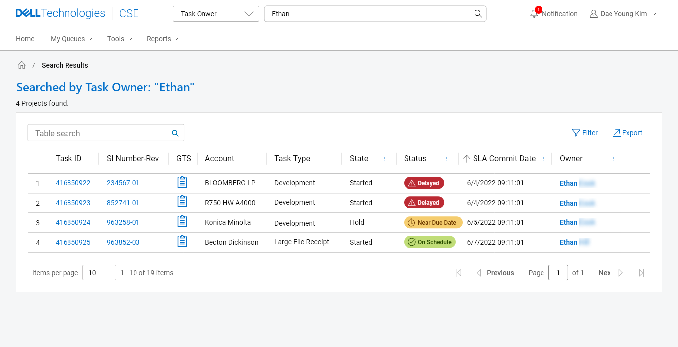
High-level comparitive view gives holistic visibility.
Comparative view on results allow engineers at the workfront to freely access information without depending on manual communication or swivel seating.
The search result provides:
![]()
Comparative view on results allow engineers at the workfront to freely access information without depending on manual communication or swivel seating.
The search result provides:
- high-level comparative view on different work items
- Direct access to different types of information based on topics
- Visual cues highlightingcorrelations between resulted item and searched keyword.
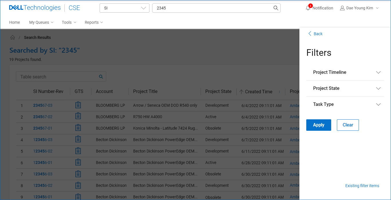
Filters matching users mental model.
Through filtering, users can quickly create a shortlist of items, gaining more accurate relevancy.
![]()
Through filtering, users can quickly create a shortlist of items, gaining more accurate relevancy.
Final Design
Selecting Search Category


Inputting Keyword(s) + Suggested search
Viewing Results

Filtering Returned Items


Key Improvements
Information at the reach of users’ hands brought efficiency and
satisfaction.
Having an easily-reachable information streamlined the users’ experience, and empowers engineers with a more independent research method.
Having an easily-reachable information streamlined the users’ experience, and empowers engineers with a more independent research method.
- Flexible Process: The new searching/filtering capabilities ensure engineers can easily find the critical resources they need to complete highly complex projects more accurately and in less time.
- Efficient Workflow: The clarity of information in CSE lets users work autonomously, reducing the dependency on manual communication with stakeholders.
- Intuitive Experience: CSE’s simplified process is consistent with the user’s mental model of real-world conventions that follow standard best practices.
User Testing

Despite the new feature being a new concept which users haven’t had a similar experience before, the new design proved to cut down the amount of time and effort, increasing user satisfaction.

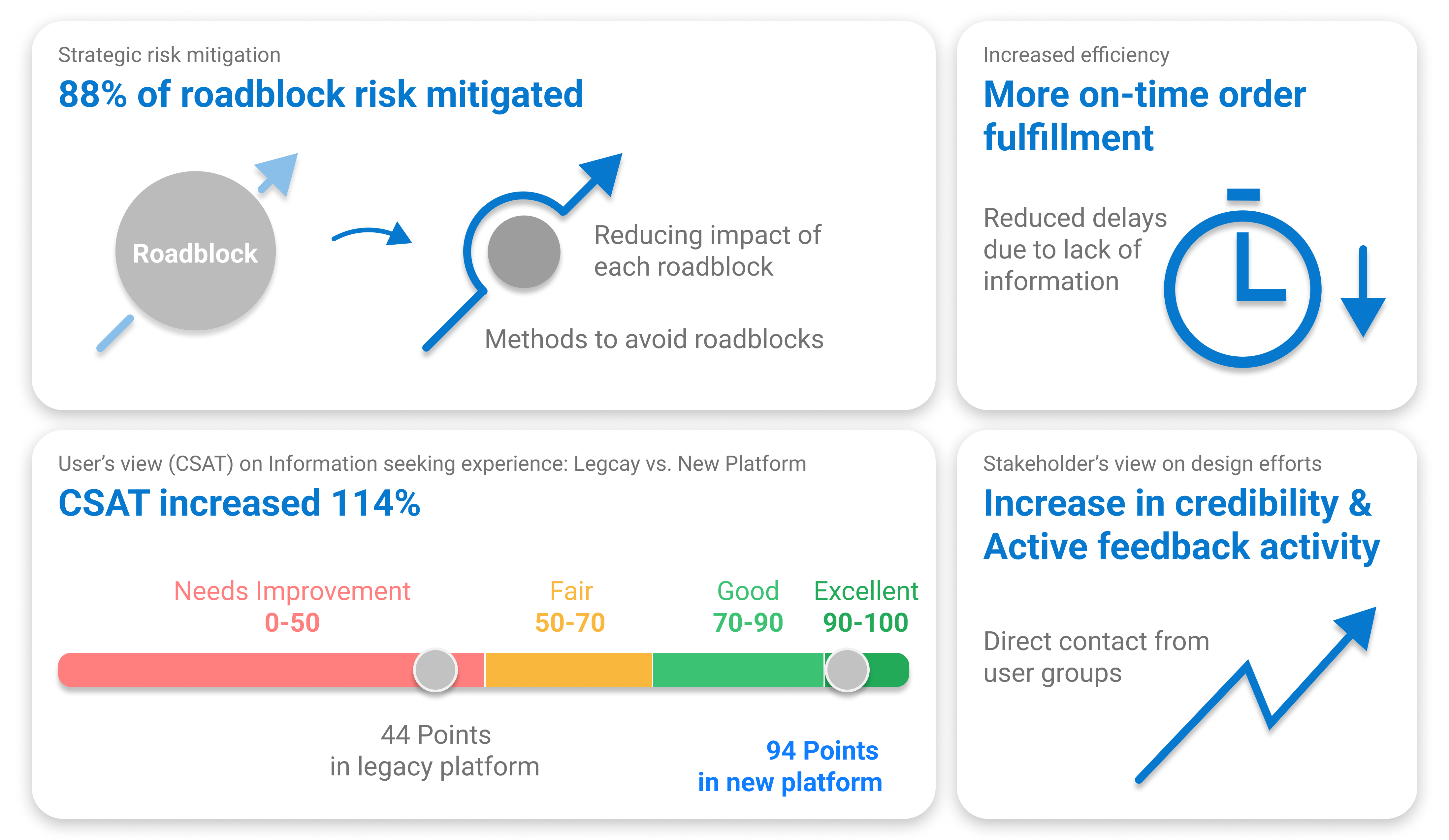
Success Metrics
Task Success Rate
![]()
First-time and experienced Users were able to access information they needed successfully with ease.
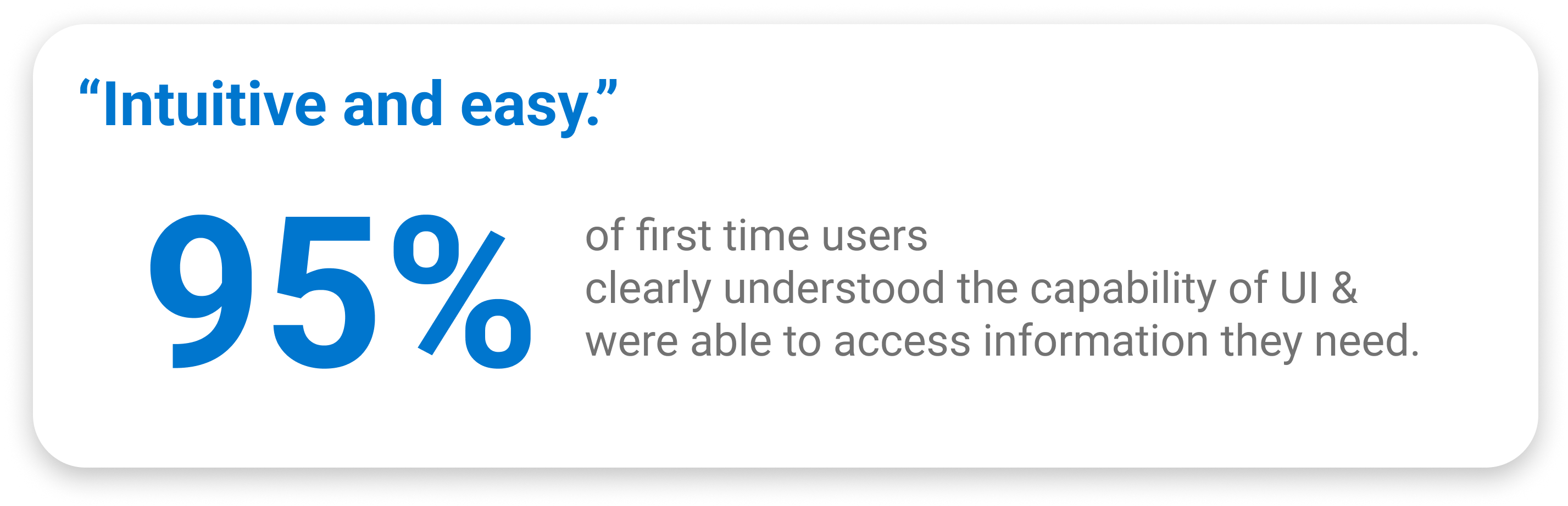
First-time and experienced Users were able to access information they needed successfully with ease.
CSAT score
![]()
Users viewed the new experience as mostly “good” or “excellent” with high satifisfaction to the overall experience design of the new feature.
Users viewed the new experience as mostly “good” or “excellent” with high satifisfaction to the overall experience design of the new feature.
Outro
What worked great....
What I would improve....
- Cross-disciplinary strategy discussions: diverse brainstorming sessions between Designers, Subject Matter Experts, Business team created learning experiences which ensured a well-rounded and strategic approach to problem-solving.
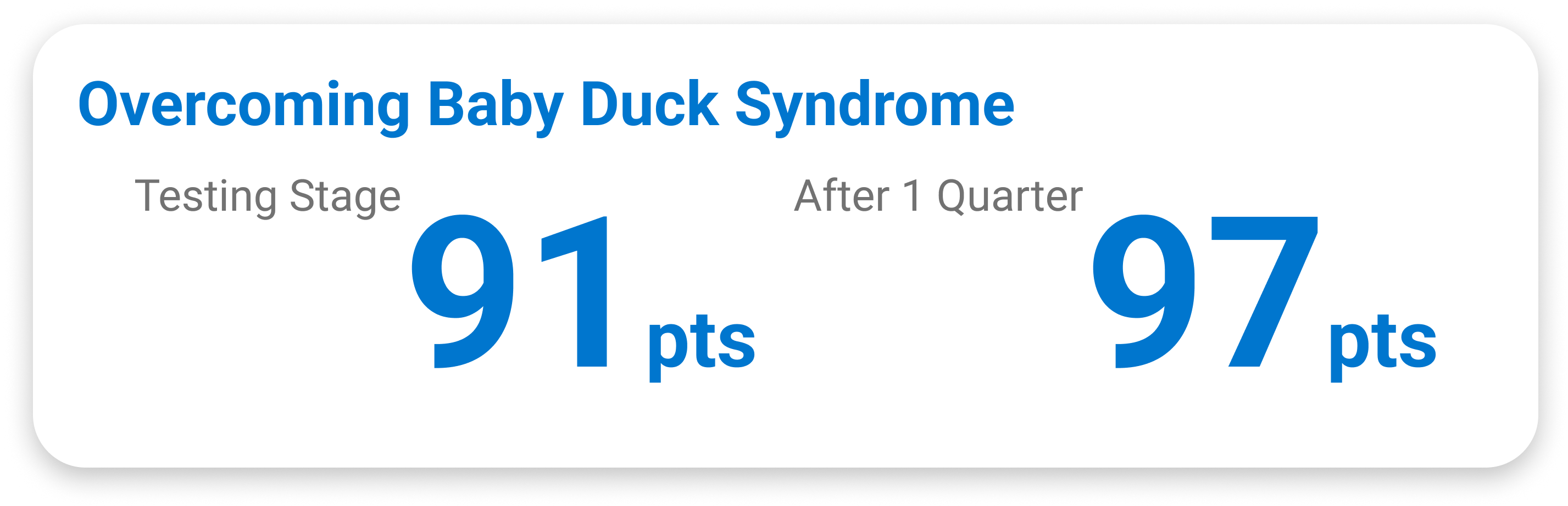
- Strategic approach to Baby Duck Syndrome: while the new experience included significant difference from the process users were used to, making the experience intuitive and balancing between new concepts and the old process helped users feel less forced or imposed put the effort to “learn.”
What I would improve....
- Tracking quantitative data earlier on: The initial phase of the project was more based on insights from qualitative user research due to technical limitation. I wish I could gather the user’s behavioral insights via quantitative data collecting as well to make a more data-informed design decisions.