Insa: Social Media Mobile App Design
Project time: 2021
Organization: 29 Labs
Role: Product Designer
Organization: 29 Labs
Role: Product Designer
Case Study | UX/Product Design | Mobile App
Overview
Context
I have brought the product from its very early concept stage to its market launch. In the process, I have facilitated user studies, created prototypes, set design systems, delivered design justifications, and closely collaborated with the development team throughout the ongoing iterative process of designing the product.
Key Responsibilities
As the co-founder of the organization and lead designer, I led the design and strategy effort of the product.
- Identified problem & opportunity space.
- Set UX and business requirements.
- Created UI/UX prototypes and iterations
- Design & conduct research and testing sessions
- Collaborate with developers to bring mockups to life.
Insa App Introduction
What is the Insa app?
(Note: The word “Insa” is a Korean word for greeting. )
Insa is a communication app designed to bring back human communication.
The app augments the interpersonal communication methods for those who are suffering from the lack/fear of human communication and help them be heard & stay connected with their loved ones.
What does it do?
Insa provides:
- Fun conversation starters with which users can easily start expressing themselves.
- Quick and easy method of mood sharing with which users can share as little as 10 seconds a day to share how they are.
Opportunity Space
Modern loneliness
Technology has made us connected more than ever, but we are alone more than ever.1.
- 41% of the Global population
- 61% of the American adults
- 79% of the Global Gen Z population
2.
The increased screen time and amount of social media-based connections widened the reach of individual’s connections but decreased the amount & depth of real human interaction.3.
Decreased real human interaction significantly increases the risk of psychological problems such as:- Low emotional stability
- Depression
- General anxiety
User Insights
What are the problems with their current method of everyday conversations?
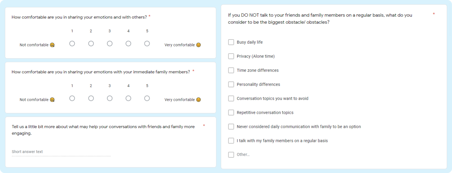
Insa team and I collected 500 surveys responses and conducted 9 interviews to find out what our potential user’s daily conversations with their close ones look like, and pinpoint their pain point.
I realized that many were feeling obligated to keep close contact with people close to them while they were stressed by lack of time in their daily schedule and personality difference.
Challenge
User Problems
- Users have trouble coming up with a topic to talk about.
- Not all conversations with family and friends are enjoyable.
- Not-so-enjoyable conversation topics are often repetitive, making users want to avoid communications.
- Users feel emotionally burdened at the obligatory small talks.
“I don’t know what to talk about with my family.”
- Peter C. (46. MA) -
“We always talk about the same thing over and over again.”
- Valerie H. (26. NJ) -
Solution
Adding family & friend time into daily routines
- Expand the user’s communication routine
- Simplify the communication between close individuals
“How might we change screen time to family & friend time?”
Design Process
Guiding Questions
- How can we make daily conversations less repetitive and more interesting?
- How can we help users feel understood and safe to express their thoughts and emotion?
Concepts
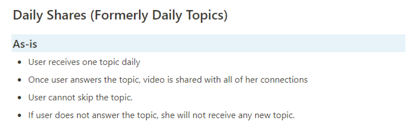
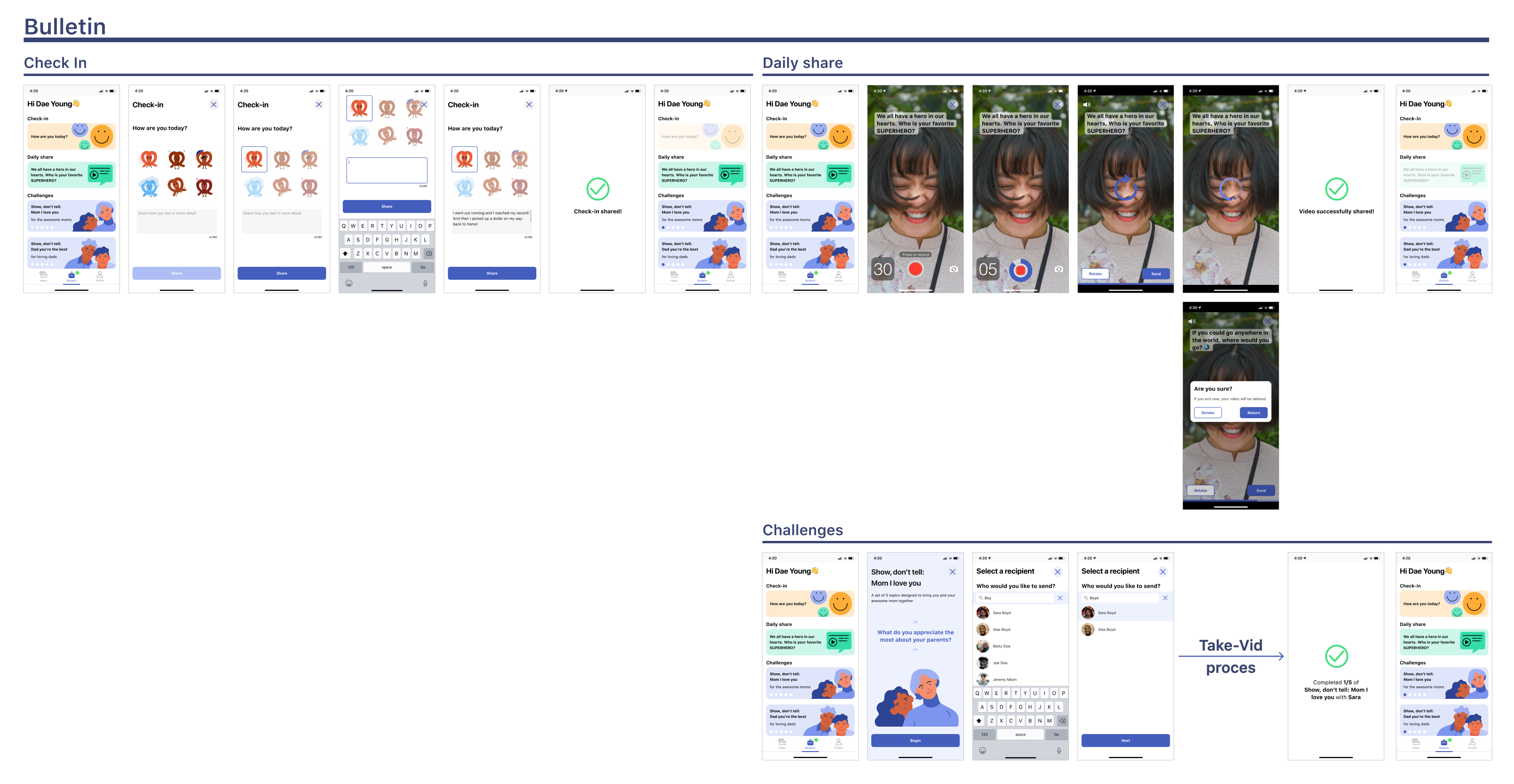
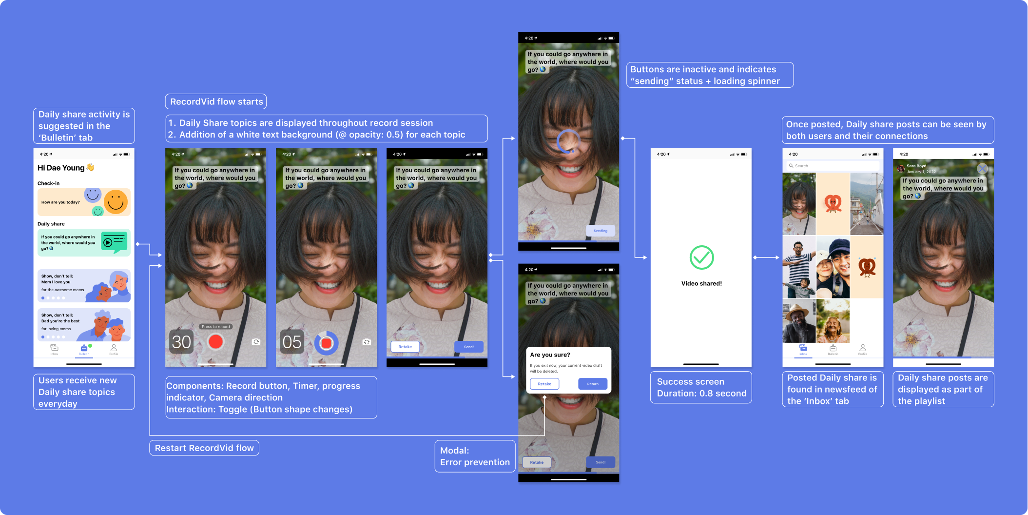
Daily Shares (Video messaging with guided topics)
Conversation topics are delivered to the users every day to bring more fun and insightful conversation between users and their connections. Giving users a specific topic to talk about helps them more clearly articulate themselves feel easier about sharing about themselves.
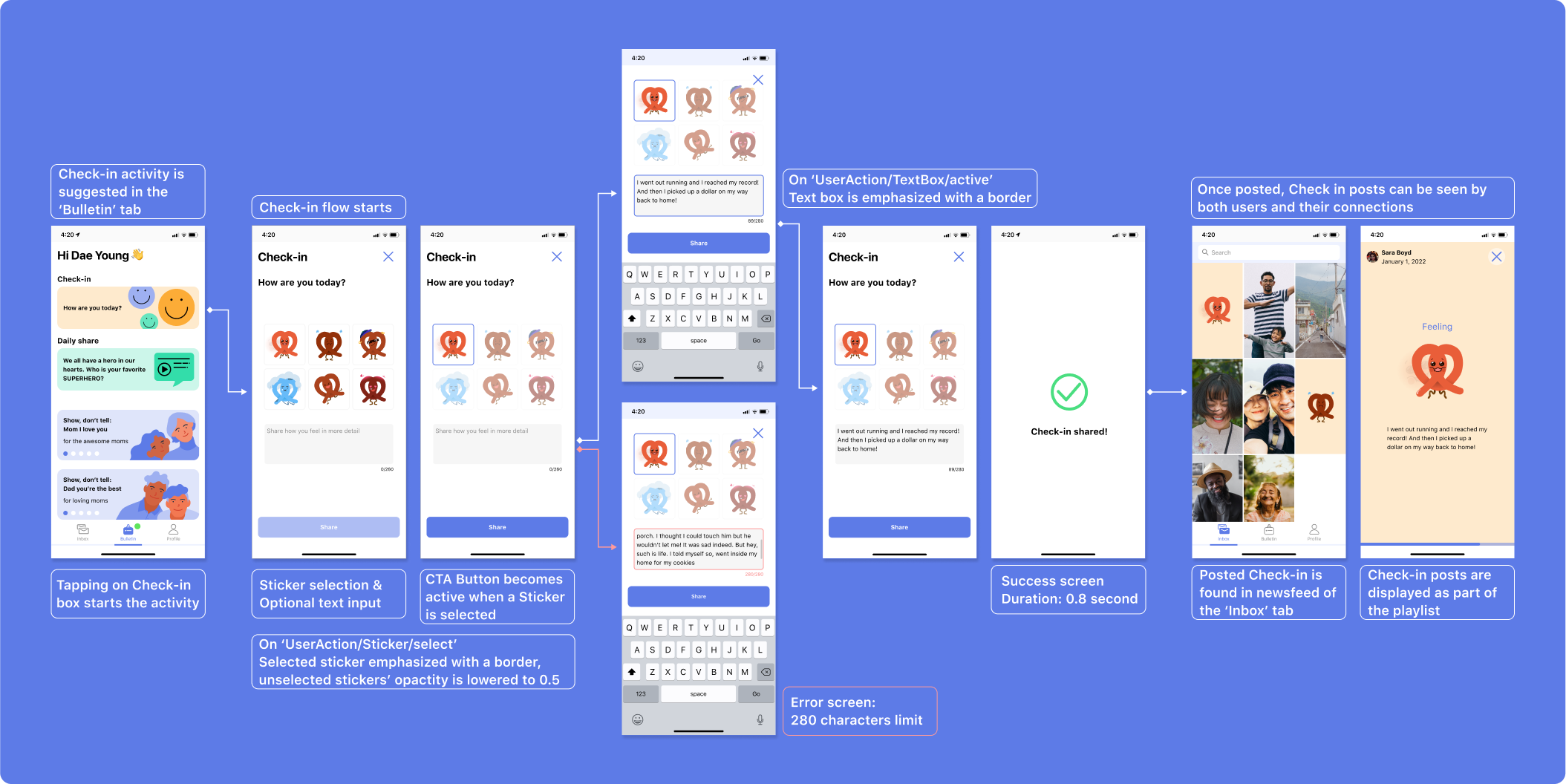
Daily Check-in (Mood posting)
Users can easily share their moods during their day through a very simple interaction of choosing a degree of their happiness and sharing with others. Simplifying the mood-sharing process removes unrelated small talk between users, and allows each user to pay more attention to how their connections are feeling.
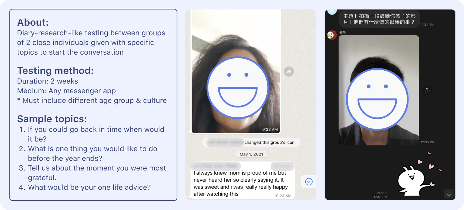
Concept Testing
What do the solutions bring to the users, and what are their reactions?
We conducted 2 weeks-long concept testings and conducted focus group interviews from different cultures and countries to find out how we can enhance their communication method.
From the study and the interviews, we found out that many participants showed positive reactions when family conversations were based on small specific topics.
![]()
From the study and the interviews, we found out that many participants showed positive reactions when family conversations were based on small specific topics.
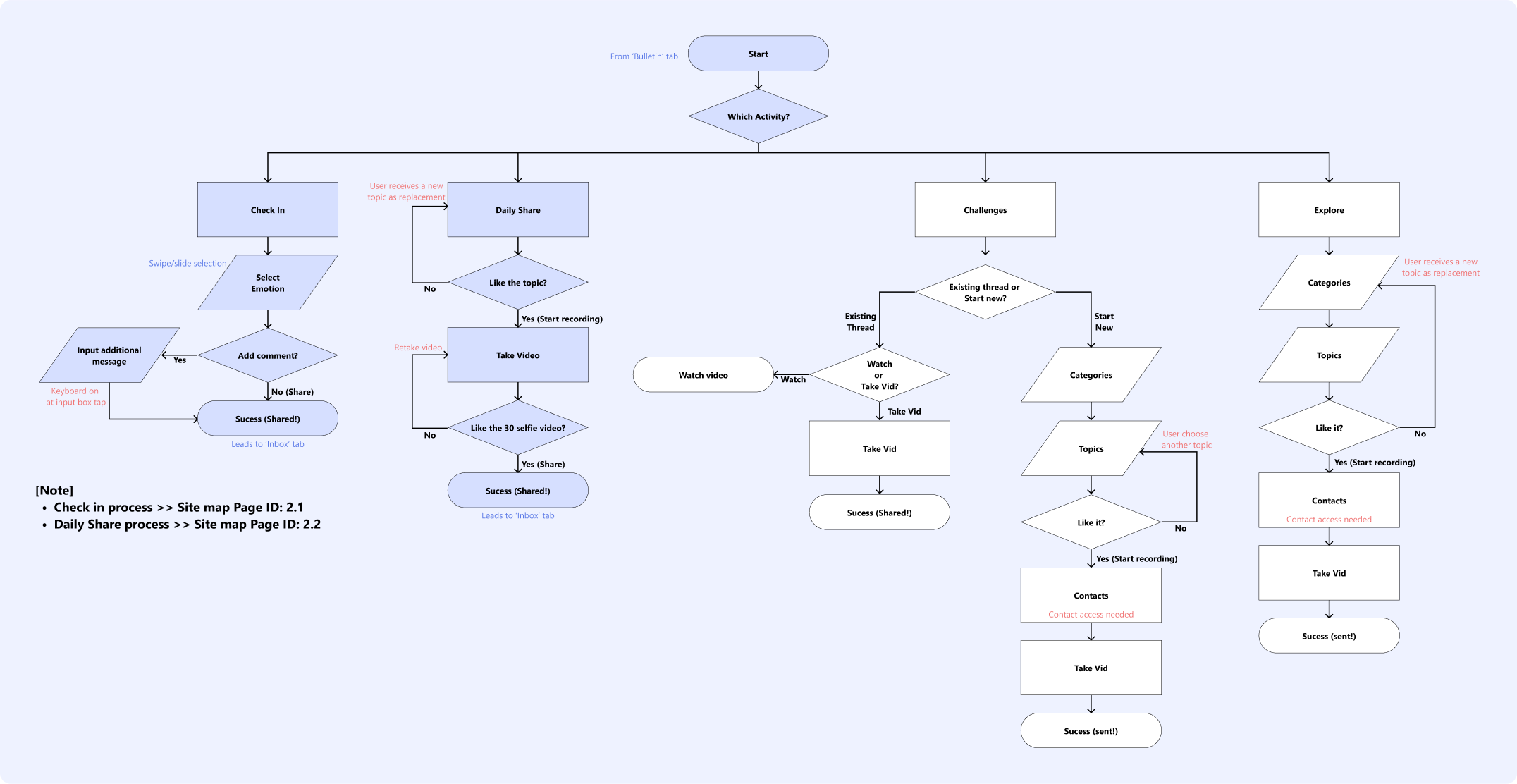
User flow
In solidifying the concept, I started by
creating a user flow. I was able to sketch out the concept into a more tangible model where we could start seeing the structure of the app.
Here, I focused on
Here, I focused on
- Understanding users’ thought process
- Creating the simplest way to reach the user goals
- Roughly Identify the interactions within the app
Architecture
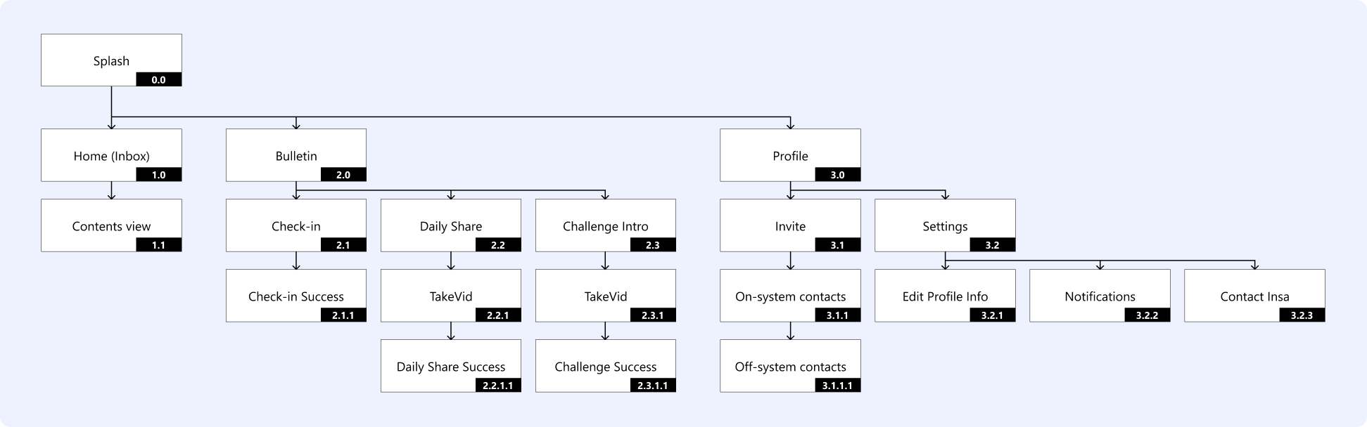
Feature list

Based on the user flow, I started listing out every detail of each feature. The list included the dynamics within the app regarding what data should be collected from the users, and what contents should be delivered to the users.
To better follow up with each version update, I have separated each item into “As-is” (current version) and “To-be” (next version).
Sketches
Low-fi: Check-in
![]()
As the Check-In feature provides a degree of happiness from which the users will choose and share, option A was taken because it provided a clear affordance that users can slide or swipe to choose the right emotion they are feeling.
Low-fi: Daily share![]()
As I did not want to burden the users to memorize the topic question while they are recording, it was important to have the topic question be clearly shown on the record screen. Also, so that the users can be aware of the remaining time of their video, I have added a progress indicator that visually show the users how much longer they can record. The original decision was option A but due to factors like screen real-estate, simpler interaction, and clearer indication of time, option A developed into option B.
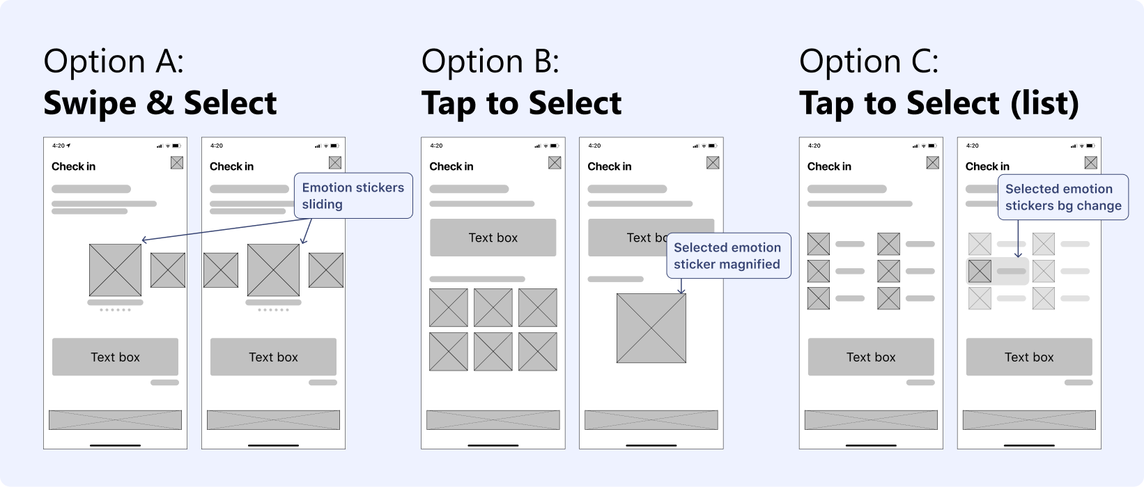
As the Check-In feature provides a degree of happiness from which the users will choose and share, option A was taken because it provided a clear affordance that users can slide or swipe to choose the right emotion they are feeling.
Low-fi: Daily share
As I did not want to burden the users to memorize the topic question while they are recording, it was important to have the topic question be clearly shown on the record screen. Also, so that the users can be aware of the remaining time of their video, I have added a progress indicator that visually show the users how much longer they can record. The original decision was option A but due to factors like screen real-estate, simpler interaction, and clearer indication of time, option A developed into option B.
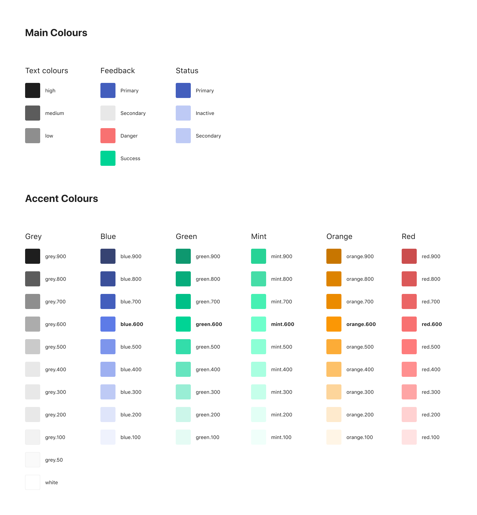
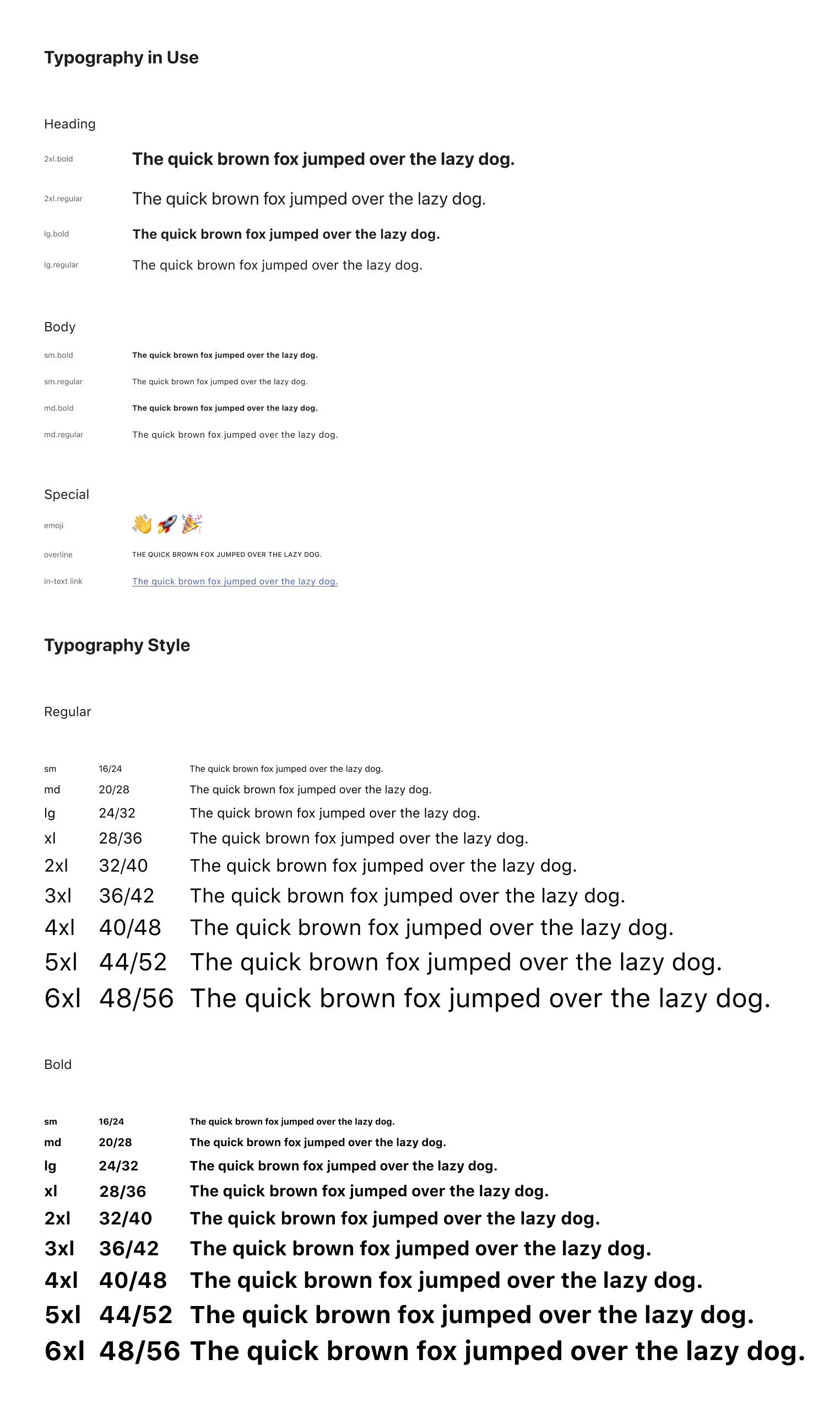
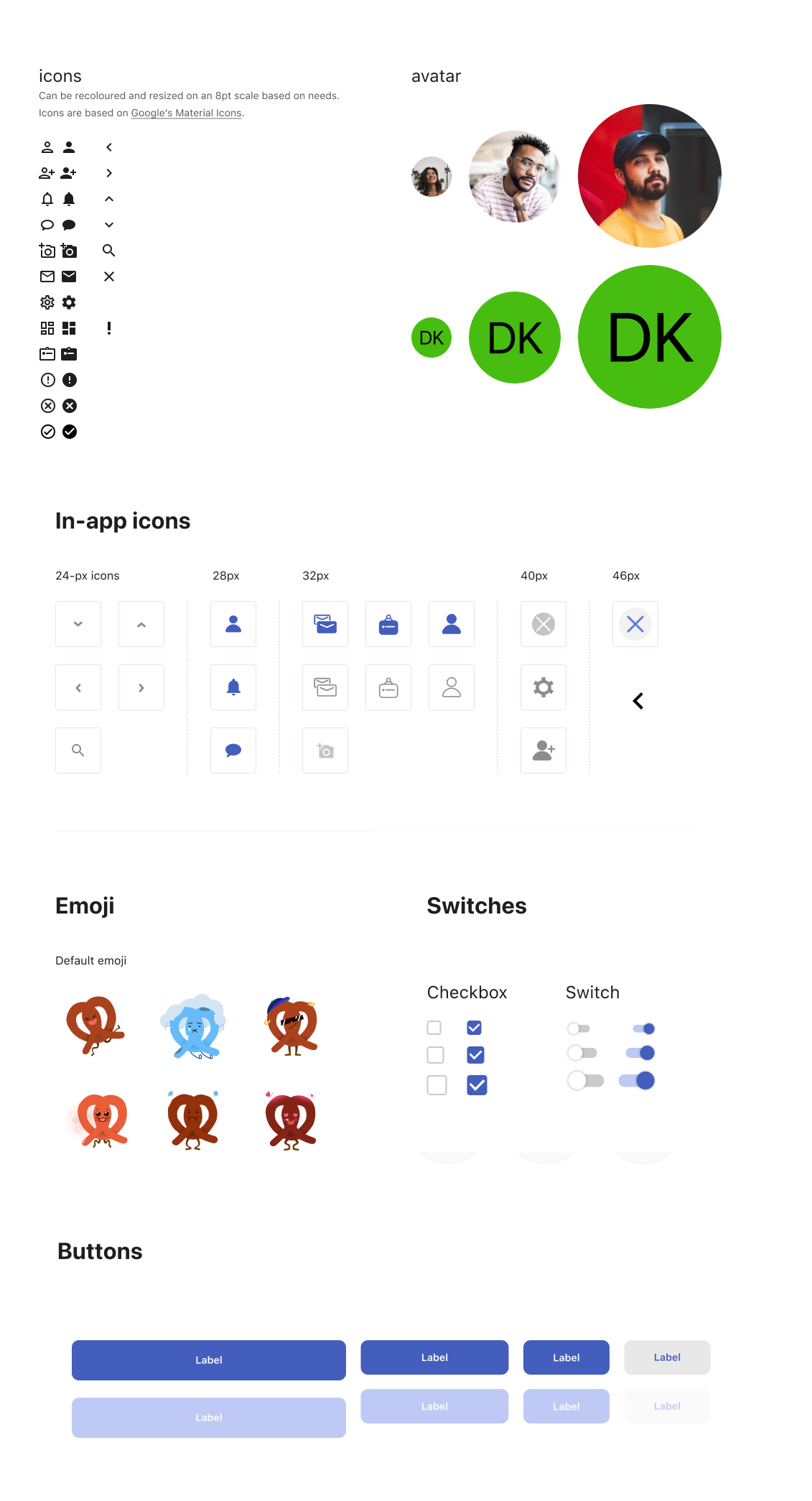
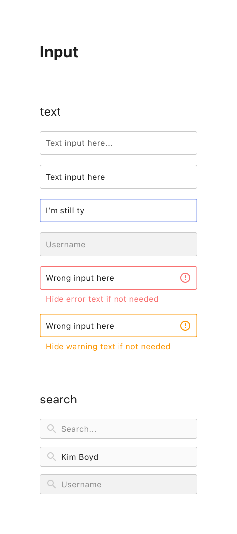
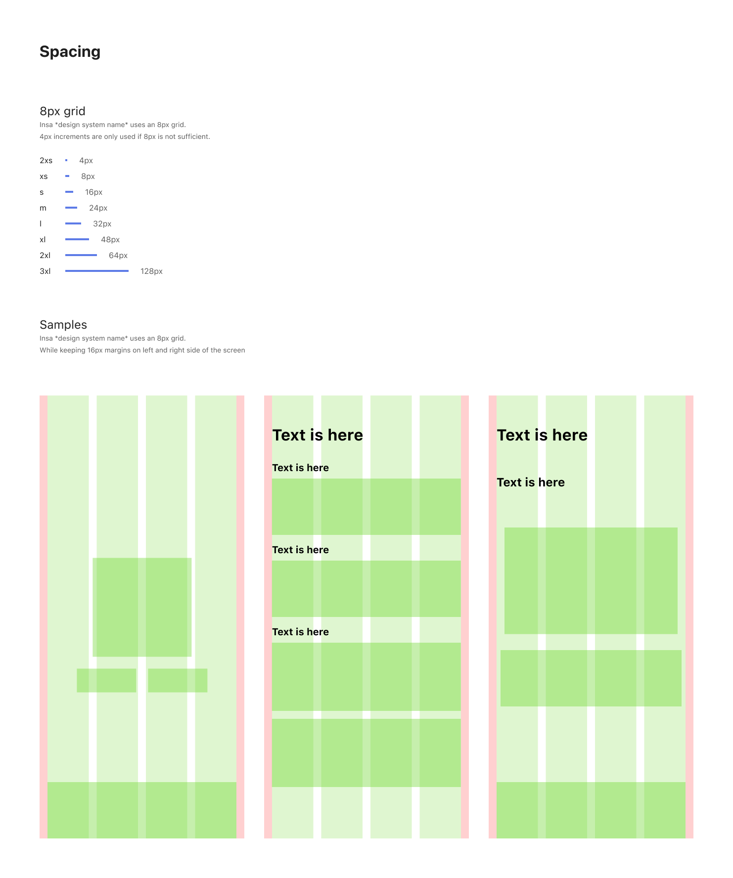
Design systems
Bring a more cohesive aesthetic and behaviors throughout the whole in-app ecosystem.
These patterns and styles were not only a rule for designers but also for developers as a reference document.
These patterns and styles were not only a rule for designers but also for developers as a reference document.
Understanding UI Framework
Understanding the technical implementation allowed me to keep the balance between making customized elements and basing the design on presets for a faster, more agile implementation.
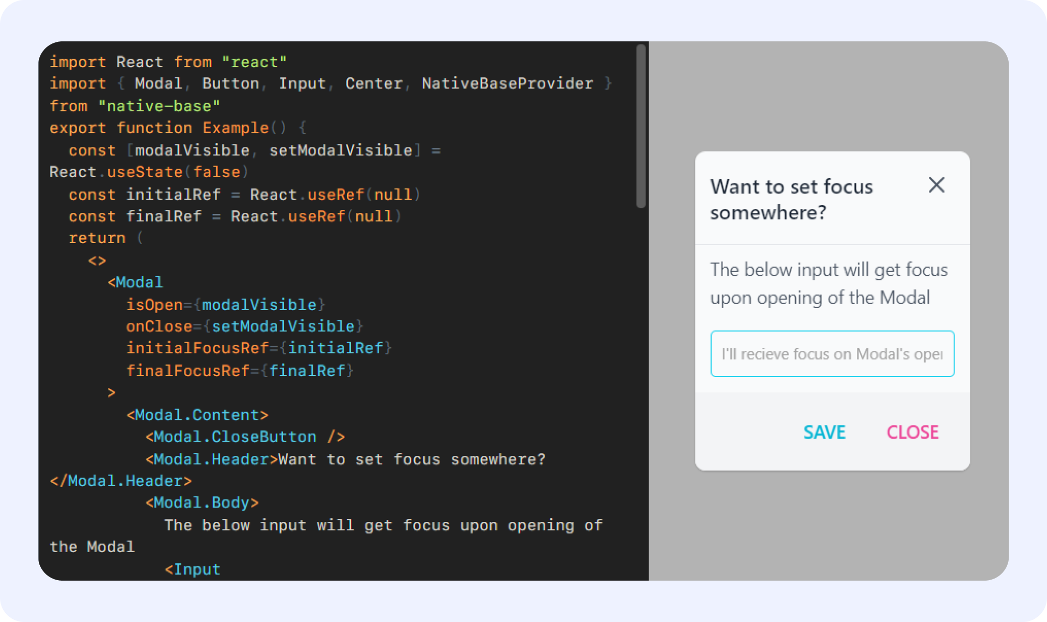
[image: screenshots of NativeBase.io documentation]
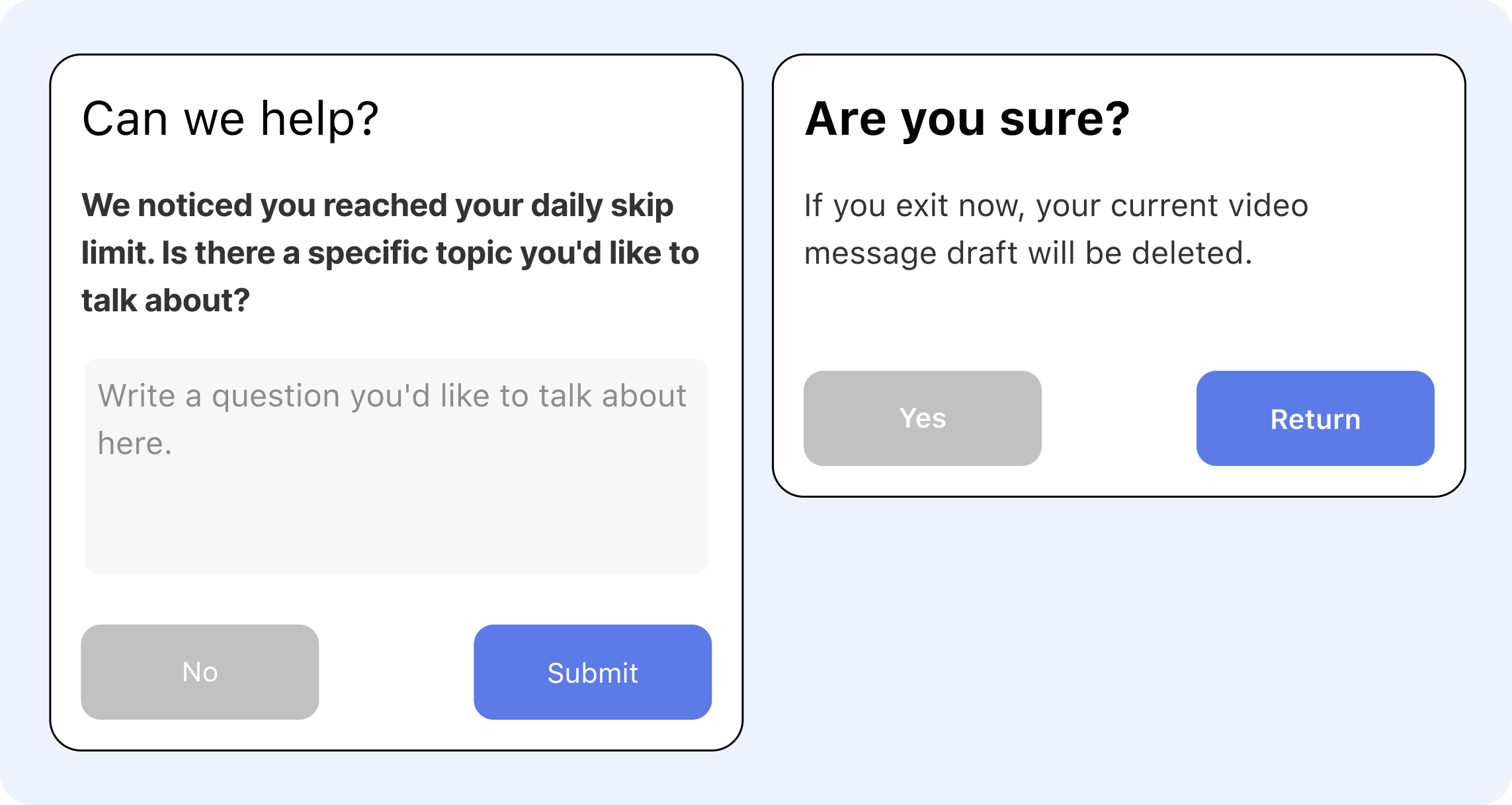
[image: Modal + pop up design of Insa]
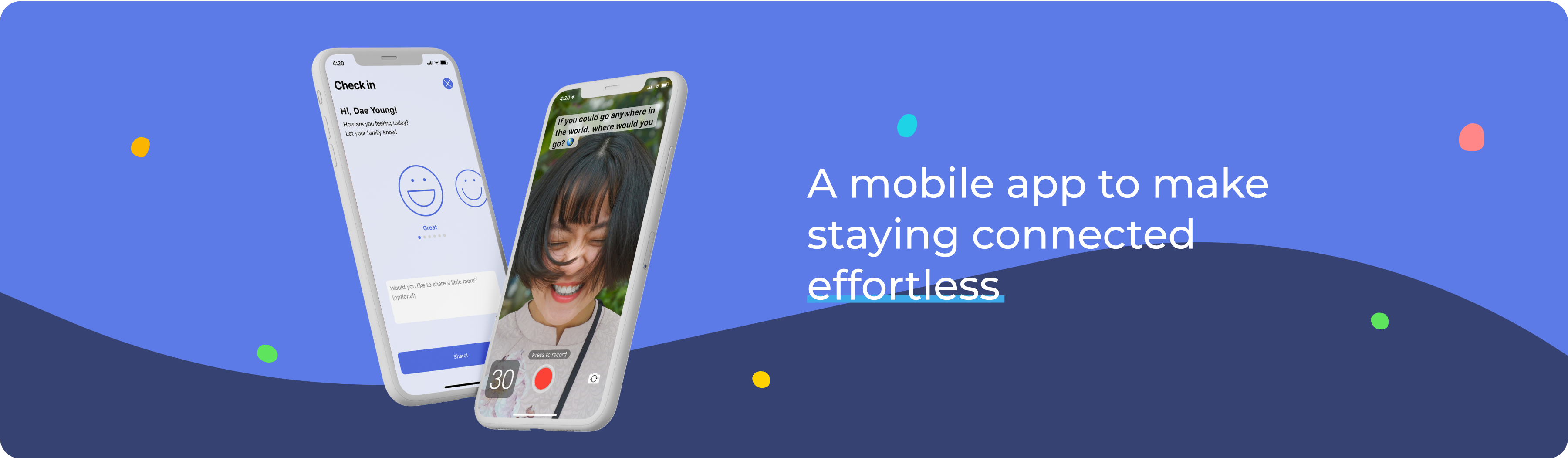
High-fi Prototypes & Mockups
Overall
Feature Highlight 1: Check-in
Feature Highlight 2: Daily share
Iterative Process
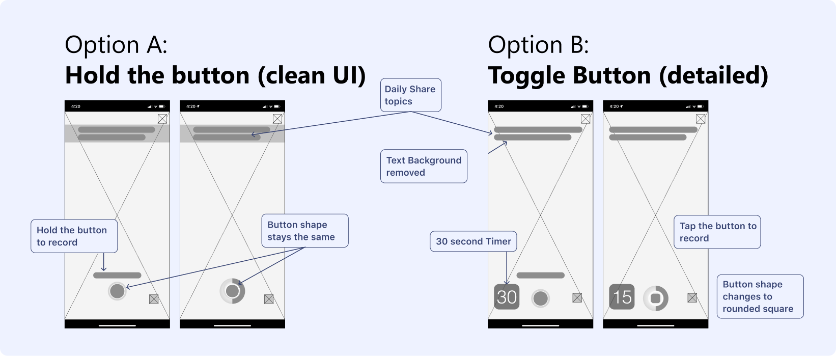
In taking a short video of oneself on a specific topic, the users need to know what they will talk about (topic), how long the video can be (duration), and how much time they have left (time). Through focus group user testing, I realized that improvements were needed.
Previous version

Problems found in the previous version
- The design of the record button lacked the visual signifier as a ‘video’ record button, and the users were not familiar with the ‘tap and hold’ method of interaction.
- The previous ‘tap and hold’ interaction of the record button created a user-experience issue of the user's thumb covering the time tracker circle.
- The topic section was taking too much of the screen real-estate and the users were feeling cramped into a small frame.
Improved version
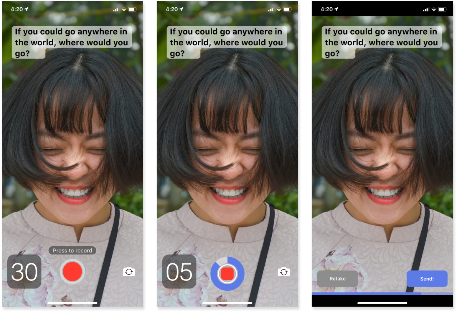
Improvements
-
Made the record screen full-screen and added a counter.
- Changed the color of the record button and its interaction to ‘toggle.’ On the‘ record,’ button changes shape into a rounded square.
- Changed the display style of the topics into captions with a semi-opaque text background.
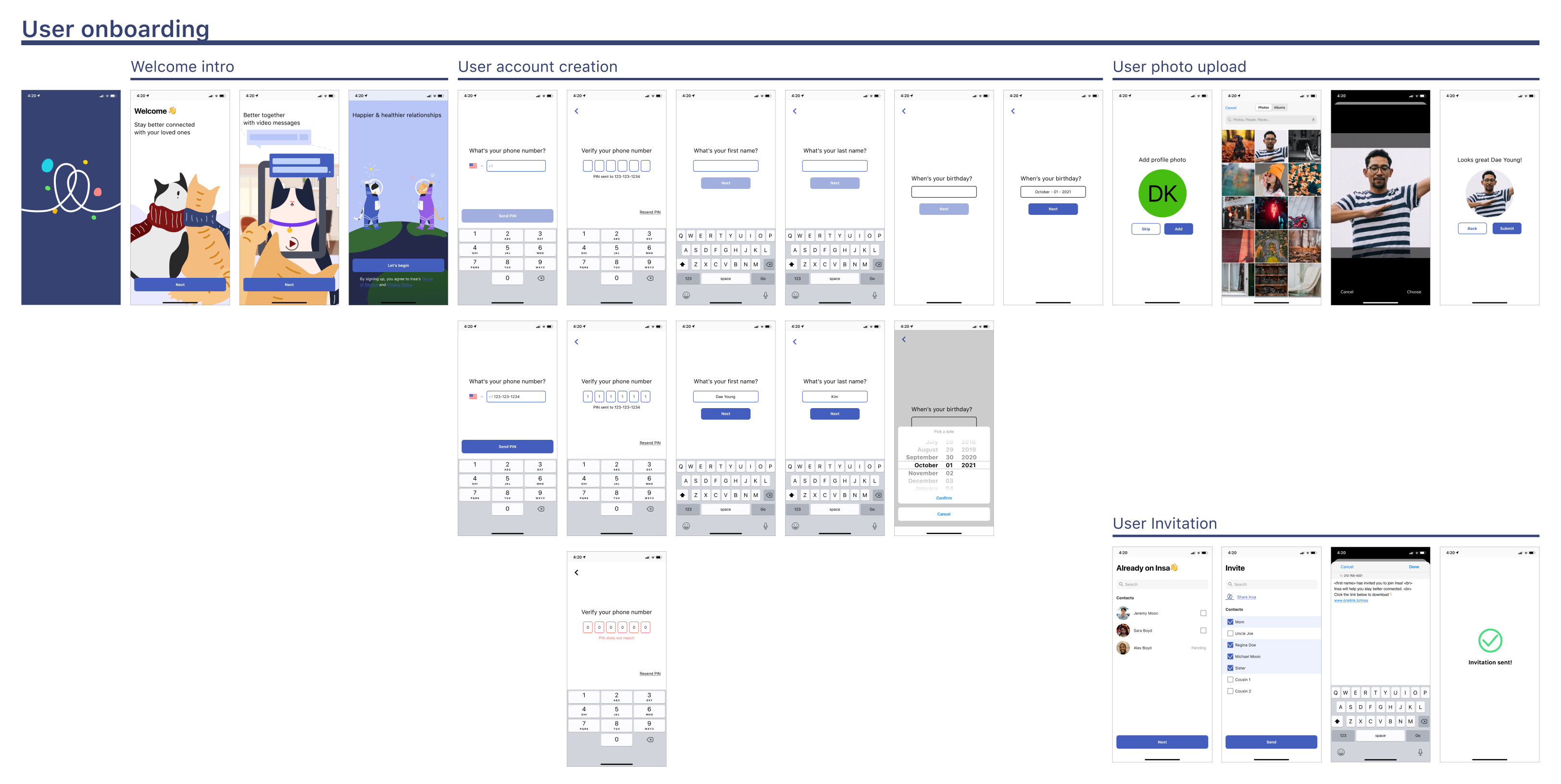
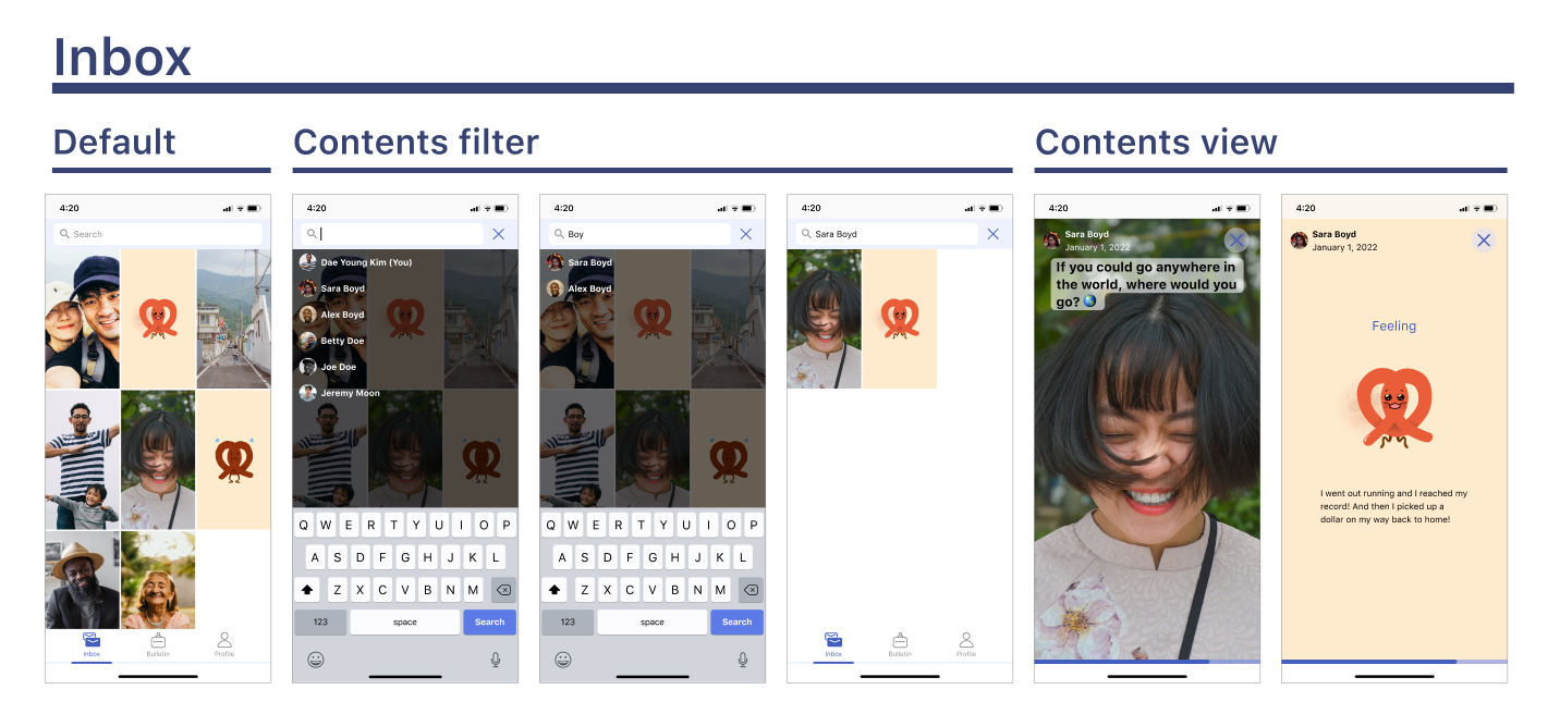
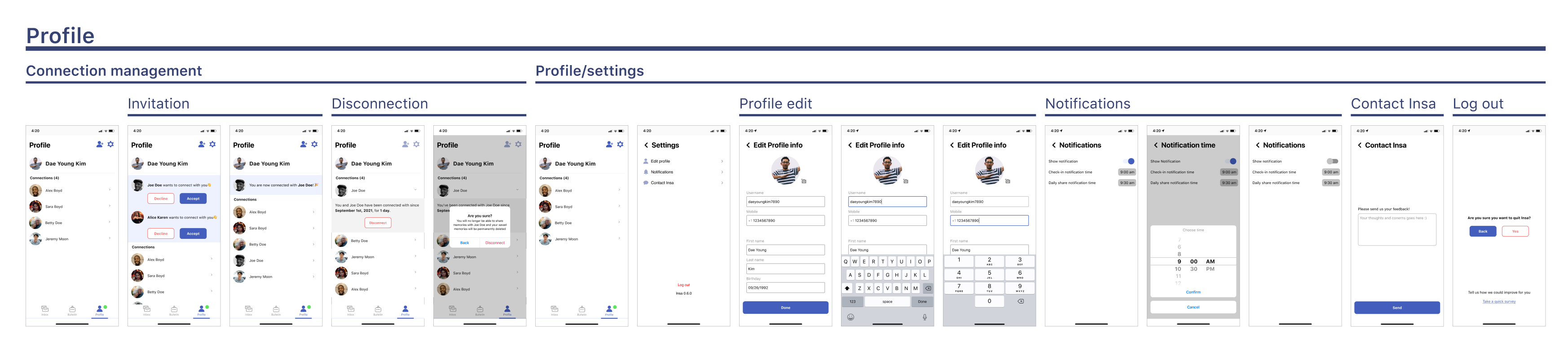
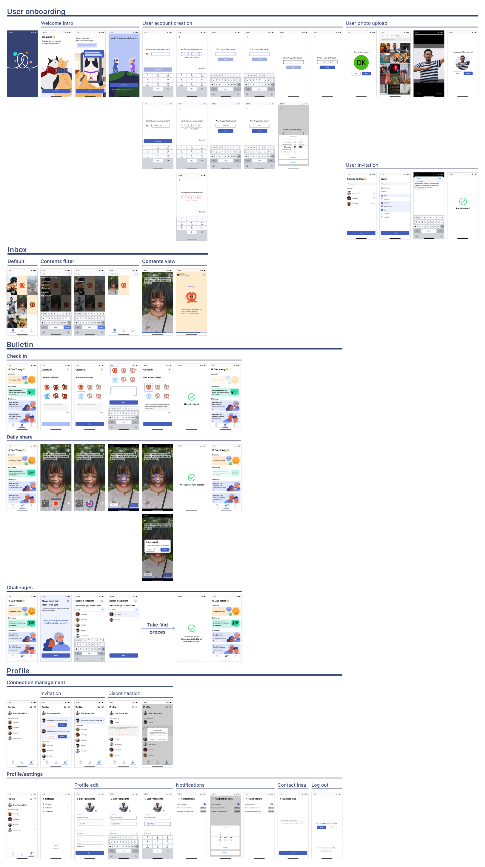
Final Design
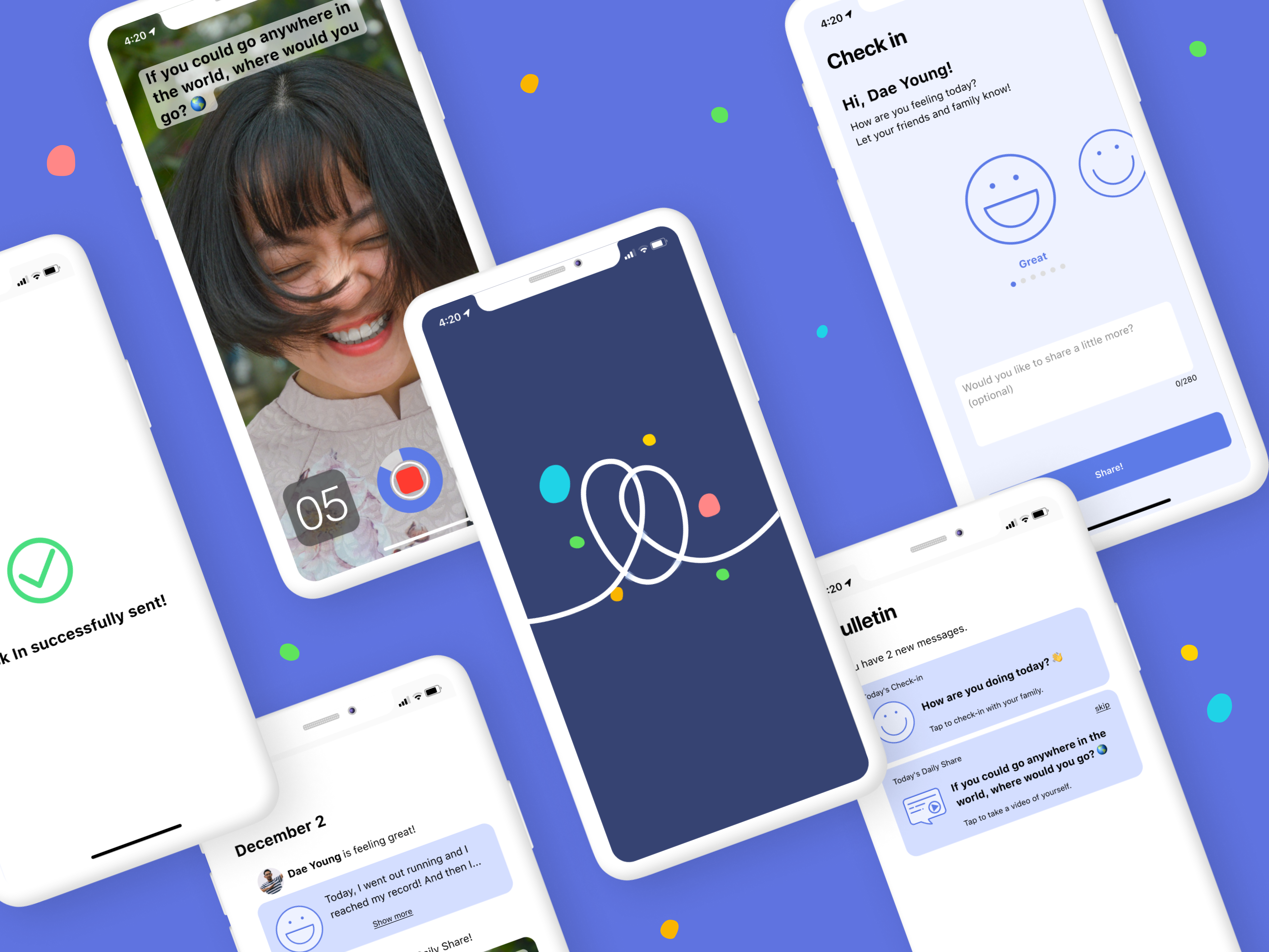
Bulletin >> (Check-in / Daily Share) >> Inbox (home)
![]()
![]()
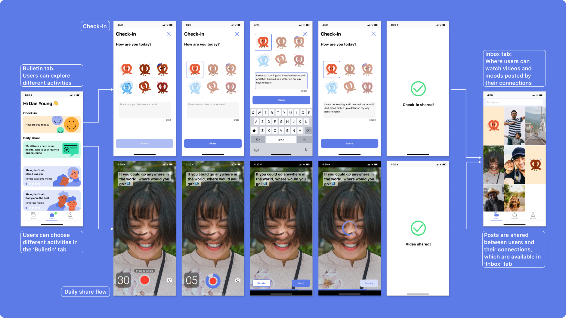
Overall
Outro
Checkpoints
User-centered design
Was the user’s viewpoint included from the beginning of the design process, and did the outcome address / fulfill the user’s needs?
Was the user’s viewpoint included from the beginning of the design process, and did the outcome address / fulfill the user’s needs?
Intuitive design
Does the design speak the users' language? Is each screen give enough affordances and a familiar signifier to easily follow the flow?
Does the design speak the users' language? Is each screen give enough affordances and a familiar signifier to easily follow the flow?
Inclusive design
Is the product designed to be used by people with visual impairment (color blindness), and those without tech-savviness?
Is the product designed to be used by people with visual impairment (color blindness), and those without tech-savviness?